Friday, November 20, 2015

The Seven Basic Tools of Quality

Every business wants to run at its most efficient equilibrium, with maximum productivity from its workers, cost effective product design and manufacture, and smart strategic decision making regarding managements and HR processes. For this to occur there must be a constant monitoring of business activity, a way of breaking down an organization into its component parts in such a way that they can be analyzed and refined, where any faults, inefficiencies, or redundant processes can be determined and dealt with.

This is the essence of defining quality in the workplace, and the Seven Basic Tools of Quality were conceived as a generic, visual form of tackling these issues. They comprise of seven forms of diagram that are varied enough to be applied to any industry troubleshooting scenario, but simple enough that workers of all types can intuitively understand and implement them.

Despite the title, there are 3 possible options for the last diagram, making 9 in total:

Fishbone diagram


So named because they resemble the bone structure of a fish, fishbone diagrams are also known as Ishikawa diagrams, after their creator and quality control pioneer, Kaoru Ishikawa. Yet another name is a cause-and-effect diagram, and this better explains their purpose — you start with an identified problem, or effect, and work backwards to figure out every causal influence on that effect.

Check sheet


Check sheets are a simple way of making sure that a quality process is followed and standards are followed. They take the form of a grid, where each row is a step that must be checked off in real time as data is gathered.


A check sheet made using ConceptDraw PRO, that takes note of faulty car parts

Control chart


A control sheet records a certain statistic at different times throughout the day, and applies to it a mean data range. If data values fall well outside that range, it could be a sign of an inefficiency or some flaw in a business process.

Histogram


A histogram is used to show the frequency distribution of a specific variable. Visually, they are arranged something like bar charts, but differ in that they don't compare disparate sets of data against each other — instead they take one value, and show its frequency within predefined intervals.

Pareto chart


Pareto charts combines both a bar chart and a line graph, where the bar chart shows individual data values, and a cumulative total represented by the line. In quality control, it is a way of spotting the largest source of defects, complaints, flaws and so on.


This ConceptDraw PRO designed Pareto chart shows the frequency of each type of defect

Scatter diagram


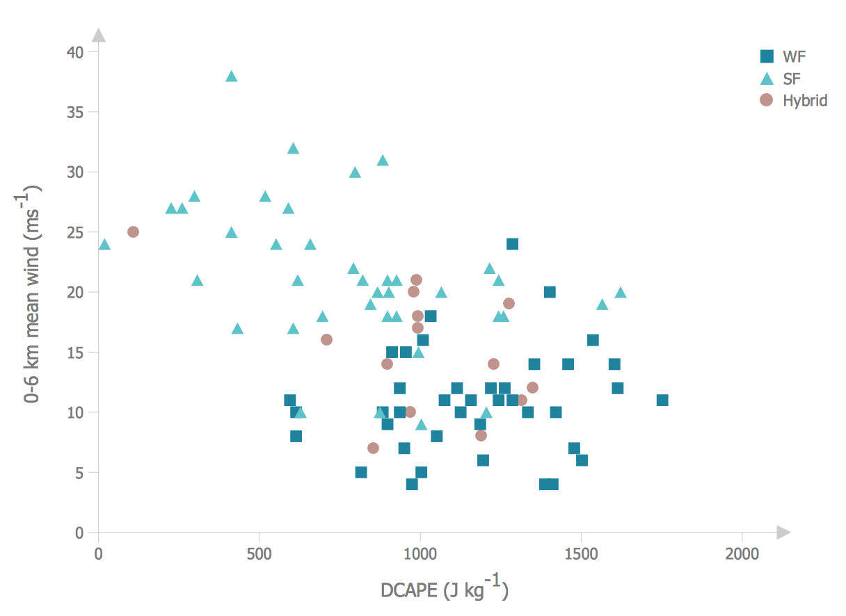
By plotting against an X and Y axis, a scatter graph can show two variables of a set of data. You can then ascertain the relationship between the variables by how the data points are clustered on the diagram.

Stratification diagram


Stratification is a means of taking data from different sources, and instead of viewing it as a single group, the data is separated by source so as better to identify patterns. To make the data even more representative, the sample size changes according to source.

Made using ConceptDraw PRO, this stratification chart distinguishes sources by icon shape

Flow chart


Flow charts are common throughout business, as a way of representing steps in a process or workflow, shown on the page as boxes containing actions, instructions or decisions.

Run chart


A run chart displays recorded data over a certain time period, where the X axis shows the passage of time, and data points are plotted along the graph as they are observed. The often show some form of measurable manufacturing output, making it possible to quickly identify outliers and shifts in scale and frequency.

These diagram tools have become invaluable to modern business, and with so many cases for their use, it's important that workers of all experience levels can produce clear and effective examples that can be shared across a team and understood at a glance.

CS Odessa are the first to bring all these techniques together under one office solution, and further extend the performance of their diagramming software, ConceptDraw PRO. The Seven Basic Tools of Quality solution provides an extensive set of vector stencil libraries and individual sample templates for each form of quality control diagram, allowing workers to chose which diagram works best for their situation without switching software or searching for multiple add-ons. To compliment the solution, CS Odessa have a dedicated online help resource, referencing specific quality diagram examples, teaching new users how to get started with their design, and offering tips and tricks to more experienced workers.

A company's success relies on quality assurance and quality output. With the Seven Basic Tools of Quality solution for ConceptDraw PRO, you have the diagramming power to reach that standard.

Thursday, November 5, 2015

Business Process Mapping

We use the phrase business process to define a particular set of tasks or actions undertaken by an organization, that lead to the production of goods or services for the customer base. It's a flexible term — one that can be used to describe the most menial or idiosyncratic of assignments, or as a way of describing a company in its entirety.

Critical study of each facet of a process is imperative for maintaining high standards within a company, and to allow management to spot any flaws or inefficiencies in its day-to-day business. The most common way of condensing a process down into an organized format is to use a visual solution — one that allows each point to be represented clearly and succinctly, giving those that are unfamiliar with the process an unambiguous interpretation of events.

To support this visual style of quality management, a number of transferable methodologies have been developed — generic diagramming solutions that act as a framework around which unique and disparate processes can be formed. The collective term for this practice is business process mapping, and here follows a brief description of some of the more popular approaches to it.

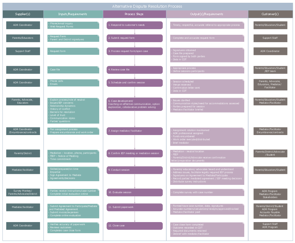
  • SIPOC Diagrams — SIPOC stands for suppliers, inputs, process, outputs, and customers, and it is a style of diagram that has a clear focus on the quality of what is going in, and what is being produced from a business process. It has a simple visual form, a segmented table that produces comprehensive lists for each category. With a SIPOC diagram, the start and end of a process is clearly defined, and the relationship between a company and its external suppliers is easily identified. SIPOC diagrams form a key part of the Six Sigma methodology, which are a set of techniques and tools to help improve quality output and minimize variability within repeated tasks.


A SIPOC diagram created with ConceptDraw PRO, showing all elements involved in hiring a candidate

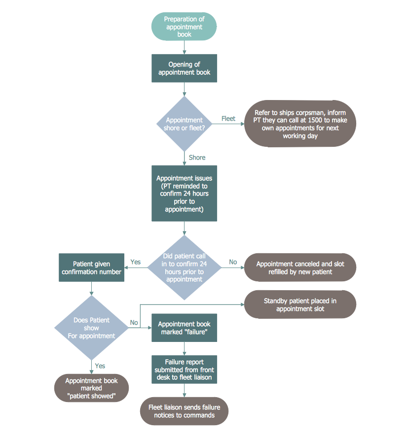
  • Business process flowcharts — A flowchart is the go-to tool for representing any basic process that involves a series of steps or decisions, particularly processes that are repeatable. Also known as a process flow diagram, these charts act as a solution model to a given problem, telling the user exactly which steps can be taken at what time, and the impact of choices made within the workflow. As with SIPOC diagrams, a flowchart can show the input and output of materials and services in terms of the customer, as well as being used to define processes from other areas of a company, such as management or human resources.


Flowcharts show repeated processes, like this sequence of doctor appointment procedure

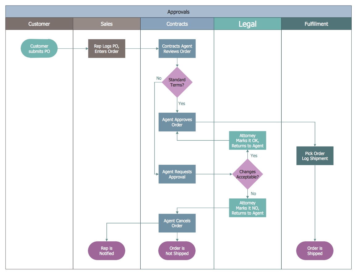
  • Swimlane diagrams — If a business process crosses over multiple departments, in can be easier to define using a flowchart that has been divided into distinct sections, or 'swimlanes'. These lanes distinguish which persons, groups, or location influence a particular step of the business process. They are useful for explicitly stating each stakeholders responsibility, and the actions each employee is expected to complete, before the process can continue to the next department. Other terms for these type of diagrams include 'deployment flowchart' and 'cross-functional flowchart'.


This swimlane diagram was created using ConceptDraw PRO, and shows the steps that each division is responsible for in a customer order

  • IDEF3 — The IDEF business process modelling language is used in slightly more specific scenarios than the previous examples. IDEF3 in particular is a scenario-driven description capture method, that has the ability to define the state of the same system or process under a variety of conditions. While flowcharts can allow a certain amount of artistic license in their design, IDEF3 uses standardized process schematic symbols — a more complex and comprehensive set of icons than found in flowcharts, and more precise in their definition.
  • Value stream mapping — A value stream map takes a wide look at the relationships between manufacturing, production control and shipping processes. They follow the value chain through an organization, from supply until it reaches the market. Like IDEF3, standardized notation is used to facilitate understanding between workers and workforces.
To achieve the professional standards required for these diagramming styles, it's best to use specialized drawing software, and a supply of the correct graphical notations. There are a number of software capable of this, but the only one that contains solutions for all the techniques listed above, extending and enhancing an already powerful diagramming platform, is ConceptDraw PRO. With the new Business Process Mapping solution, joining previous solutions such as IDEF Business Process Diagrams and Value Stream Mapping, ConceptDraw PRO offers a comprehensive selection of process mapping tools to aid quality management within an organization and help refine workflows.


Thursday, October 15, 2015

Sales Process Flowcharting

Should a business or government agency need to visualize a solution model for a some aspect of their business, there is a good chance that resulting diagram will take the form of a flowchart. They are an invaluable tool when charting a sales process — they give you the opportunity to visualise and understand the process, and also serve to highlight any issues or bottlenecks that might occur throughout the workflow. As an example of how ubiquitously intertwined flowcharts are with business process, here are a number of synonyms that may also be used:
  • Flow chart
  • Process flowchart
  • Functional flowchart
  • Process map
  • Process chart
  • Functional process chart
  • Business process model
  • Process model
  • Process flow diagram
  • Work flow diagram
  • Business flow diagram


In its most basic form, a flowchart consists of a series of steps that act as a diagrammatic representation of a simple problem or process. Each step is represented graphically by a box — most commonly a square (representing processing steps or an activity), or a diamond (representing a decision). These boxes are linked by arrows, that indicate the direction of the workflow.


A flowchart doesn't so much represent the flow itself; rather, it focuses on the controls that govern the flow.

In practical terms, individual algorithms, workflows or processes can require a specific approach when designing, documenting or analyzing a flow chart. This has resulted in a widened selection of boxes and icons to cater for more niche controls and commands, and several flowchart variants stemming from the 'classical notation' style (the basic style outlined above). For instance, you can make a flowchart 'cross-functional', by introducing swimlanes that divide a process into organizational units. You also need to decide on your chart's perspective — is it from a managers, system analyst, or customer's point of view? A workflow diagram connects multiple processes, and allows you to define execution responsibility.

Flowcharts can be subdivided even further in accordance to what type of process they describe:
  • Decision
  • Logic
  • Systems
  • Product
  • Process
  • Program
  • Document
  • Data


The Sales Process


For most commercial organizations, the sales process is inherent to its existence and ability to create profit. Although each company will achieve this aim in its own way, the core selling process remains similar throughout — a potential buyer or prospective customer exchanges money with an organization in return for goods or services. Despite this rather simplistic definition, there exists huge scope as to which approach is taken. Indeed, it is not uncommon for the sales division to be the largest within a corporate structure, employing a team of salespeople, analysts, and the sales managers, who are in charge of sales division operations.

Sales operations is an umbrella term for all the processes and business activities that a key to running a sales division. The sales operation team is responsible for its smooth and efficient running, and to act as a liaison between other parts of company structure, such as IT, Legal, HR, Finance, or Marketing. There is a continual focus on sales process engineering, which is the analysis and refinement of a sales process in order to increase its efficiency or to identify problems within the workflow; other benefits might include the ability to standardize customer response into the form of a process, or as a platform to conduct buyer and seller risk management. A sales process itself is defined by strategy, sales targets, quotas, forecasting and demand; some theories also ascribe to a generic framework to build your process around — Rich, Spiro and Stanton identify 8 steps that make up a sales process in Management of a Sales Force (12th Ed. p. 66). They are as follows:
  • Prospecting/initial contact
  • Pre-approach — planning the sale
  • Identifying and cross questioning
  • Need assessment
  • Presentation
  • Meeting objections
  • Gaining commitment
  • Follow-up

The ideal method with which to represent these step-by-step processes is through the flowchart medium.

Charting The Flow


The practical applications of sales process flowcharts are numerous and wide ranging. At sales level, you might map the process of customer interaction, from first contact to sale. Or a system flowchart, that depicts the flow of actual physical elements or company resources. A program flowchart can be used to process map a software system for an online shop. For a manager, a sales process can generate key performance indicators, that allow senior management to discern the effectiveness of a process, and take corrective action if needed. The main aim is ongoing quality and margin improvement, process refinement and study of effectiveness. To take this concept even further, there are a number of 'doctrines' that some practitioners will apply to business process mapping.

Six Sigma is not only a set of tools and techniques to assist with your sales process diagrams, it is more like a doctrine for the whole company to follow. It shares the main ideals of process analysis and refinement, but adds focus on financial return, emphasis on strong leadership, and a rule to only ever make decisions based on verifiable data and statistical analysis. Following a similar pattern is ISO 9001, which represents a quality management system with a strict set of guidelines. Now adopted round the globe, it has become the de facto quality standard for business, and its application is routinely assessed by a third party. What both of these systems do is apply process mapping theory to every aspect of an organization; flowcharts provide the flexibility with which to do this.

As you can see, a simple premise like a sale process flowchart can culminate in an almost endless array of options and elements, not to mention the constant need for updating and refinement. Once again, ConceptDraw have produced a solution that allows you full freedom of expression when creating your sales flowcharts. The Sales Flowcharts solution for ConceptDraw PRO provides you with six sizable vector stencil libraries, including the full set of classical flowchart notation symbols, as well as stylized pictograms and arrows that bring energy and color to your design. It is ideal for users of all experience levels — beginners are catered for with handy templates and lessons that help you get the most out of the solution. Leave no process unmapped with the Sales Flowcharts solution from ConceptDraw.

Friday, October 2, 2015

States and territories maps of Australia

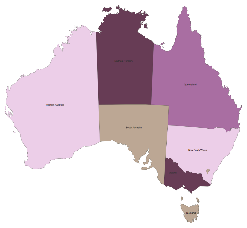
When European explorers and settlers reached Australia's shores, they brought with them the style of social structure, politics and governance from their homelands. Early settlements became colonies, some of which would form the foundations of modern day Australian cities such as Sydney and Melbourne. These colonies began to divide the mainland (and certain surrounding islands) into distinct territories — initially their boundaries were ever-changing, but by the end of the 1800s they eventually settled with the formation of six states that have remained largely unchanged to this day.

With Australia no longer serving solely as a penal colony for British convicts, and more and more migrants reaching the country, population and infrastructure expanded rapidly, leading to a call to unify the individual territories under one flag. After some negotiations, the six member states were ratified under the Commonwealth of Australia, that although still holding strong ties with the United Kingdom, would be largely self governing. In the 120 years since this unification, the political map of Australia has been consistent; the following is a list of the six states that comprised the nation then and now:

  • South Australia
  • New South Wales
  • Queensland
  • Victoria
  • Western Australia
  • Tasmania


There are also 3 self governing territories — Northern Territory, Jervis Bay Territory, and the Australian Capital Territory, which is something like the USA's Washington DC. Over the years, Australia has also grouped several island chains under the Commonwealth, resulting in seven extra external territories.


Australian map was created with ConceptDraw PRO, it shows states and territories of Australia

The distinct and long standing territories, aligned with interesting geological features across a wide expanse, make thematic maps an ideal way of presenting geological, geographical or political information relating to Australia. A thematic map studies a particular theme or subject area in relation to a particular location — often the focus is on the distribution and spatial variation of whatever data is being analysed.

Thematic maps lack a certain level of detail — they often do not show features such as road networks or contours, but instead tend to use a basic political map as the foundation, with an added layer of data to give context. A common example is a map of population density. Using Australia in this instance, the map would consist of a basic outline with state borders, and some form of dot distribution to indicate population. The more dots condensed in one area, the more populous it is — looking at Australia we would see a large collection of dots spread along the (particularly South) coast, while the center of the map (the Australian Outback) would be relatively clear.

A geospatial infographic goes one step further than a thematic map, in that it can tackle a broader range of subjects and use a more dynamic visual style to get its message across. The idea behind an infographic is to tell the viewer a story about that subject, perhaps answering a posed question or using statistics to back up a more general statement. Rather than just focussing on one set of data, such as Australia's population density as used in the last example, an infographic can expand on linked causes and effects — health issues, pay disparities or political leanings for example.

There are few limits on how this information is presented, only that visual techniques are used to present the data in a way that is easily identifiable and understandable, and that a coherent argument is made.

The way geospatial and social data is collected now results in reams of data that is impenetrable to a casual viewer. Thematic maps and infographics have risen to prominence as effective ways of collating this data, and breaking it down into manageable pieces that are conducive to sharing through social media streams. At CS Odessa, we recognize the fact that working with complicated data while trying to express this creatively through original diagrams represents a challenge, particularly with the fast moving trends and deadlines that many are bound to. We constantly endeavour to provide the solutions to these problems.

The Australia Map solution for ConceptDraw PRO is our latest solution for knowledge workers and business people. We try and make every step of the creative process as simple and intuitive as possible. Inside the Australia Map solution you will find templates and samples to get you started, a library containing vector graphics representing each Australian state, and if you're still struggling for inspiration then there is our comprehensive help and video tutorial section to explain some tips and tricks. Used in conjunction with other ConceptDraw PRO solutions libraries, our vector graphics allow you to create rich and varied infographics along any theme. For a more concentrated map, these images allow extra levels of detail — you can choose to display your map with county borders, named geographical regions, and major towns and cities.

Once you've finished you design, we offer a full range of import and export capabilities, including exporting to different file formats, or sharing your creativity through presentations.

The Australia Map solution for ConceptDraw PRO is part of an ever-growing collection of visual solutions from CS Odessa — aiming to provide inspiration and productivity at every stage of the design process.

Monday, September 21, 2015

Business process modelling using IDEF0 and IDEF3 diagrams

Originally developed and research funded by the US Air Force, Integration Definition, or IDEF, refers to a family of modelling languages that are used in the fields of system and software engineering. The key aim of IDEF was to devise a method for modelling data subsystems in a generic fashion; a way of sharing information and defining business processes between associated agencies and suppliers. The first language of this form, IDEF1, was initially concerned with data storage systems, and the ability to represent data regardless of how it is physically stored and used. Other IDEF languages were soon developed - 0, 1X, 2, 3 and 4 are considered developed in full (a further 10 exist no more than beyond initial definition), and focus on applying the same methodology to all aspects of business process modelling (BPM), such as business operations, functional modelling, and process flow descriptions.

Since the late 1960's, Douglas T. Ross had been developing a systems engineering and software engineering methodology called the Structured Analysis and Design Technique (SADT), with its intention being to describe a system as a hierarchy of functions. With backing from the US Air Force, this would eventually be formalised as IDEF0, a function modelling language capable of analyzing and communicating the functional perspective of system.

The methodology identifies the prime function, and displays it on the 'Top Level Context Diagram' using a standardized set of symbols. From this diagram, diagrams for lower level processes can be produced. The language is now established enough to be used by a wide variety of businesses and organisations to show dataflow and business process using precise and strictly defined diagrams and graphical notations.


Fig. 1. IDEF0 Diagram Example


According to IDEF.com, these are the communicative concepts to be followed when creating an IDEF0 diagram:
  • Diagrams based on simple box and arrow graphics.
  • English text labels to describe boxes and arrows and glossary and text to define the precise meanings of diagram elements.
  • The gradual exposition of detail featuring a hierarchical structure, with the major functions at the top and with successive levels of sub functions revealing well-bounded detail breakout.
  • A "node chart" that provides a quick index for locating details within the hierarchic structure of diagrams.
  • The limitation of detail to no more than six sub functions on each successive function.

Acting as a complement to IDEF0, the IDEF3 process description method records specific knowledge of behavioural aspects of a system or process. There are two modes in which it can do so, as described by Wikipedia:
  • Process Flow Descriptions, to capture the relationships between actions within the context of a specific scenario.
  • Object State Transition, to capture the description of the allowable states and conditions.

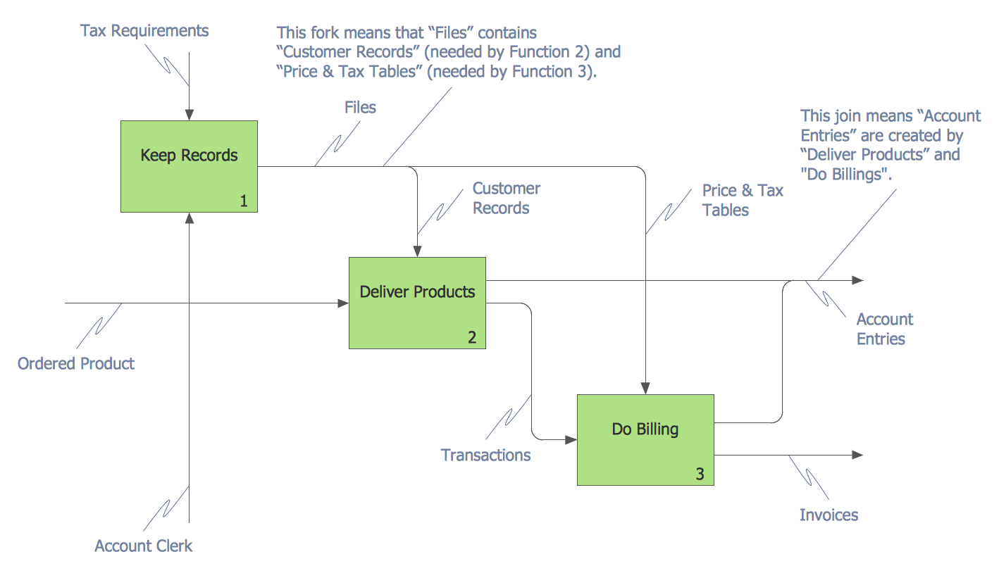
Whereas IDEF0 describes an idealized model of a system or process, an IDEF3 diagram provides a description of actual process flow within an organization or business, or the changes that occur to an object within that system. This method of knowledge capture is recorded in two different perspectives - users are able to create both process schematics and object schematics using the IDEF3 schematic symbols.

Fig. 2. IDEF3 Diagram Example

ConceptDraw has created a solution that collects all symbols necessary to create professional IDEF0 and IDEF3 diagrams, as well as templates and step-by-step lessons that help create your own process diagram from the ground up. The IDEF Business Process Diagrams solution for ConceptDraw PRO contains extensive libraries of vector stencils that allow users to create professional looking diagrams of any complexity. The power of ConceptDraw PRO means that recording a business process is a quick and painless task - smart connectors allow you to map your diagram on the screen almost as quickly as it comes to mind.

IDEF methodology is suitable for almost any form of business, and for anyone who needs to record enterprise architecture in a process driven manner. The IDEF Business Process Diagram solution and ConceptDraw PRO cater for these needs, giving both beginner and experienced users the tools they need to create effective business process diagrams.


Friday, September 4, 2015

Types of Organizational Structures


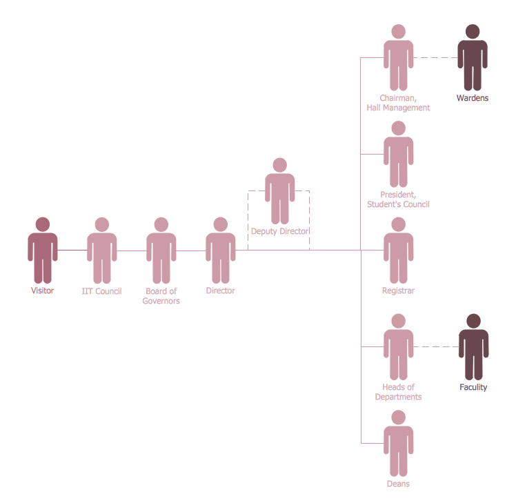
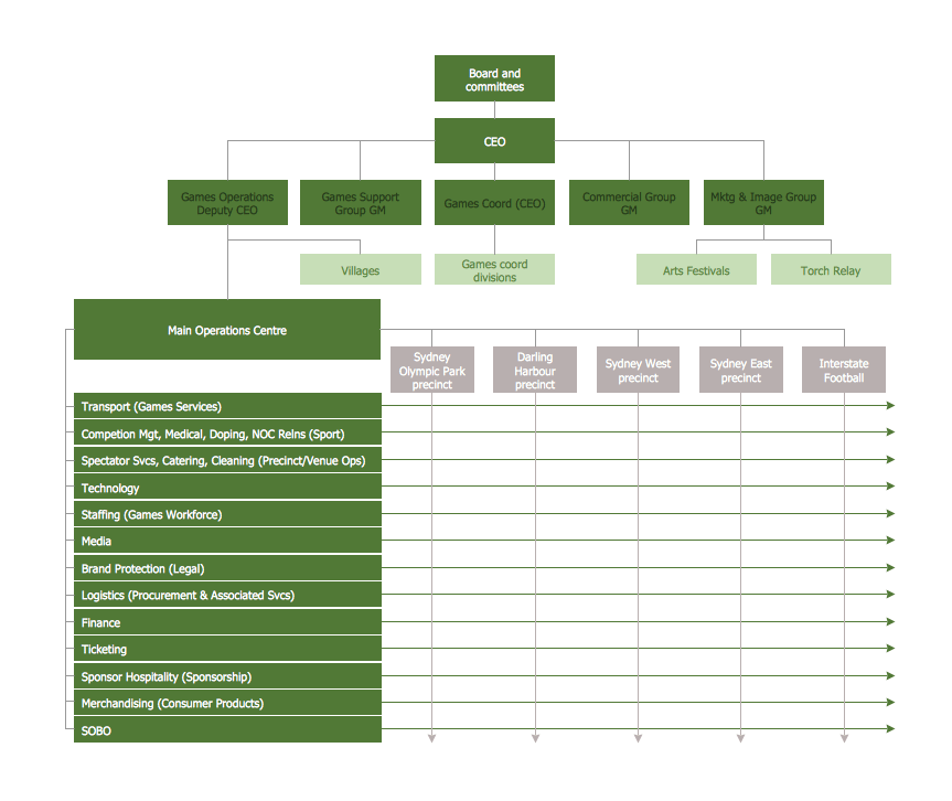
It is important for any organization or business to have a clear structure, that recognises and defines employees roles and responsibilities, and ultimately provides the framework for accomplishing the goals and aims of the company. There are a number of factors which decide how formal the structure needs to be, how complex, and which template it should follow — factors such as size and location of the company, how much management is needed, and the size and divisions of the workforce.


Organization structure types


The three main types of organizational structure are as follows: hierarchical, flat, and matrix. A smaller company, or one with few levels of middle management, might have a more organic structure — there is a shared knowledge base and centralized decision making; all parts of the workforce have common interaction with each other. But in a larger company made up of various divisions and teams, who may have only brief interactions and essentially work independently from each other, it is crucial to have a structure in place that clearly defines the decision making and supervisory process.


Hierarchical organization structure


Perhaps the most common form of organizational structure is hierarchical. This structure can be represented as a pyramid, with a single entity in authority at the top, with subsequent levels of power beneath them. Each member of the pyramid reports only to their direct subordinates or superiors, limiting the amount of communication overhead, which can be seen both as an asset or a limitation. It is easy to see where a hierarchical structure would be an effective solution; companies that have offices based in disparate locations, a business that focuses on diversified markets, any organization with need for multiple levels of middle management.


Flat organization structure


A flat organizational structure differs from a hierarchical one by almost entirely dispensing with middle management; rather than a pyramid, there is a 'flat' layer between staff and executives. In real terms, this means that almost all staff are involved in the decision making process and produce reports centrally — it can be viewed as a typically democratic structure.


Matrix organization structure


A third form of organizational structure can take the form of a matrix. This structure is commonly found in businesses that have more than one line of reportage. For instance, a company might contain an engineering department with engineering managers who workers report to. However, these workers might also have to liaise with different product or project managers depending on current tasks. Some form of matrix organization is found in most large-scale modern businesses.

Friday, August 28, 2015

Food Court Infographics


    Food is big business. We all need it, and we like variety in our diet — most people have, and expect, a wide selection of international cuisine available locally, through supermarkets or specialized restaurants. Increasingly, a further expectation is that food is prepared and served at a rapid rate, a by-product of the time constraints placed on us by modern living. It is no surprise then, that the last few decades have seen a dramatic rise in the number of 'fast-food' outlets, and shopping mall food courts, offering quick, cheap meals that can be delivered or taken away from the shop. Despite this (or perhaps because of), there always exists a huge market for healthy living, nutritional information, and diet methodology; juice bars, health food shops and vegan restaurants are some of the establishments that position themselves to provide services in this area.

    While large fast-food chain establishments have existed on the high street for many years, and street vendors operating from stalls or carts even longer, the growth of large shopping precincts and entertainment centres has seen the establishment of the modern 'food court'. The standard design is a selection of disparate cuisines being sold around a central eating area. In the Americas and Europe, it is common to find a few examples of the big chains — McDonalds, Starbucks, KFC — as well as more national-level eateries such as Greggs in the UK, or Dairy Queen and Orange Julius in the USA. Similar food attractions can be found in Asia, where they form something like an impromptu market, with vendors and street carts gathered around a covered pedestrian area decked with seating and tables.

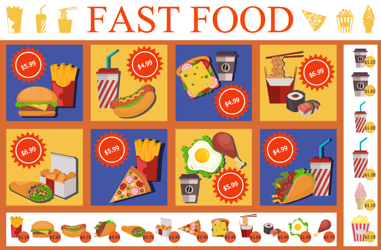
Example 1. Food Court Infographics — Fast Food Menu

    Globalization has seen the export and import of the most popular cuisines from around the world, even to the point where a foreign meal can be adopted as a favourite national dish — such as in England, where a takeaway curry (originally from India) is often the evening meal of choice. Chinese, Indian, Thai and Italian outlets have all become ubiquitous and well-liked options for take-away food. In return, the West offers its fast-food chains — McDonald's alone has 31,000 restaurants, spread over 126 countries in 6 continents. Subway and Pizza hut operate in over 90 countries each, while the German company Wienerwald has entered into African and Asian markets.

    Another effect of globalization is that we are more well travelled now than ever before — and this means a lot of exposure to foreign tastes and delicacies, sometimes with little information as to what is actually on the plate in front of you. This is why most of the fast-food restaurants you are familiar with will make a point to provide visual displays; food related imagery that gives you a better indication of what meals are available. You can see it everywhere — on brand logos, in advertising, on menus and in leaflets, or used to illustrate food infographics. Using food art and imagery helps educate those unfamiliar with the cuisine, and adds a reference point to textual information.

    Here is a list of describing the sort of fast food places you can expect to find in a food court, or as an outlet on the high street, and some additional information on practical uses for food themed illustrations and infographics:

  • Thai/Chinese
    East Asian cuisine is based largely around the staples of rice and noodles, which can be accompanied by meats and seafood, as is often fried. So common place is this type of food in the West, that it can be found in high-class restaurants, as well as cheaper takeout options. Noodle bars and fried wok stalls are becoming increasingly popular as smaller stalls in food courts.
    A food court in Thailand can contain a number of rice and noodle stalls, each offering a different cooking style or meat cut. For travellers, it's important that menus and displays are adequately illustrated, to save having a surprise meal of the local delicacy, such as larvae or insects!
  • McDonald's/KFC/Burger King etc.
    Sometimes known as burger joints in the USA, the major fast-food chains are spread far across the world, selling largely the same menu, save for certain items that are specific to the country or area. As well as burgers, they offer fries, fried chicken, milkshakes and ice cream, generally processed and of a low quality, but cheap and quickly prepared.
    You will see examples of food art and illustrations throughout their stores. McDonalds add an infographic to your tray, showing calorie content and ingredients within their products. KFC brand themselves using cartoon depictions of fried chicken. Almost all will have a menu display behind the counter that groups pictures of food items together to represent the different meals on offer.

Example 2. Design Elements Food Court Infographics — Fast Food

  • Indian
    As mentioned, the traditional Indian curry has become a national dish in the UK, and enjoys popularity elsewhere. It uses traditional Indian spices and cooking styles, to create dishes that can be measured by hotness — ranging from a mild korma to a hot and spicy vindaloo. Although originally made as vegetarian dishes, restaurants in the West add either beef, lamb or chicken to the meal.
    One very specific way you will see curry outlets using food imagery, is to denote just how hot a dish is — Indian menus often use a 'chilli system', where one picture of a chilli next to a menu entry means it's a mild curry; five little chilli icons means bring the tissues and milk!
  • Juice bars and Salad bars
    We all know fast food isn't great for us, and it's not going to give you a very balanced diet. There are enough people concerned with what they eat to create opportunities for outlets that provide a more organic form of produce. Juice bars are something of an antithesis to the milkshake bar — a place where you can select from a range of fresh fruit and vegetables, which are then blended into a smoothie. Salad bars are a buffet selection for people who want to take the vegetarian option.
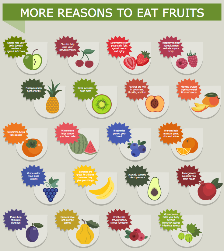
    Food infographics can be used in this style of establishment to promote healthy living, give information on invaluable 'super foods', highlight their nutritional content, and provide information on how to maintain an effective diet.

Example 3. Food Court Infographics — More Reasons to Eat Fruits

    Taste is obviously the final test, but how food is presented, it's visual appeal, is also a crucial factor in what we gravitate towards. The pictures in McDonald's will always look plump and delicious, regardless of how the burger actually appears. Food imagery can be found in branding, advertisement, menus and shop art, so it is important for companies to have the software and illustration library necessary to create professional, visually striking designs.

    ConceptDraw PRO, the award winning diagramming software from CS Odessa, provides a powerful platform with which to create graphic-driven works. To extend PRO's functionality, new solution are released regularly to help in a wide variety of illustrative fields. The latest, the Food Court solution, provides a bright collection of colorful food related images and icons, divided into themed libraries; suitable for use as menu graphics, on marketing leaflets, or accompanying text on an infographic. Also included are samples of food based drawings, a comprehensive help section, and video tutorials on a range of subjects, giving handy tips and leaving you free to concentrate on creating professional looking food art, suitable for any shop front, poster or menu.