Every business wants to run at its most efficient equilibrium, with maximum productivity from its workers, cost effective product design and manufacture, and smart strategic decision making regarding managements and HR processes. For this to occur there must be a constant monitoring of business activity, a way of breaking down an organization into its component parts in such a way that they can be analyzed and refined, where any faults, inefficiencies, or redundant processes can be determined and dealt with.
This is the essence of defining quality in the workplace, and the Seven Basic Tools of Quality were conceived as a generic, visual form of tackling these issues. They comprise of seven forms of diagram that are varied enough to be applied to any industry troubleshooting scenario, but simple enough that workers of all types can intuitively understand and implement them.
Despite the title, there are 3 possible options for the last diagram, making 9 in total:
So named because they resemble the bone structure of a fish, fishbone diagrams are also known as Ishikawa diagrams, after their creator and quality control pioneer, Kaoru Ishikawa. Yet another name is a cause-and-effect diagram, and this better explains their purpose — you start with an identified problem, or effect, and work backwards to figure out every causal influence on that effect.
Check sheets are a simple way of making sure that a quality process is followed and standards are followed. They take the form of a grid, where each row is a step that must be checked off in real time as data is gathered.

A check sheet made using ConceptDraw PRO, that takes note of faulty car parts
A control sheet records a certain statistic at different times throughout the day, and applies to it a mean data range. If data values fall well outside that range, it could be a sign of an inefficiency or some flaw in a business process.
A histogram is used to show the frequency distribution of a specific variable. Visually, they are arranged something like bar charts, but differ in that they don't compare disparate sets of data against each other — instead they take one value, and show its frequency within predefined intervals.
Pareto charts combines both a bar chart and a line graph, where the bar chart shows individual data values, and a cumulative total represented by the line. In quality control, it is a way of spotting the largest source of defects, complaints, flaws and so on.

This ConceptDraw PRO designed Pareto chart shows the frequency of each type of defect
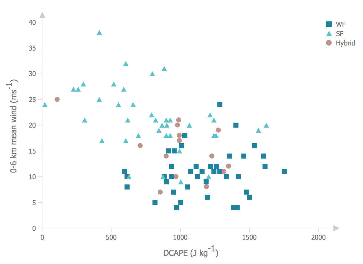
By plotting against an X and Y axis, a scatter graph can show two variables of a set of data. You can then ascertain the relationship between the variables by how the data points are clustered on the diagram.
Stratification is a means of taking data from different sources, and instead of viewing it as a single group, the data is separated by source so as better to identify patterns. To make the data even more representative, the sample size changes according to source.

Made using ConceptDraw PRO, this stratification chart distinguishes sources by icon shape
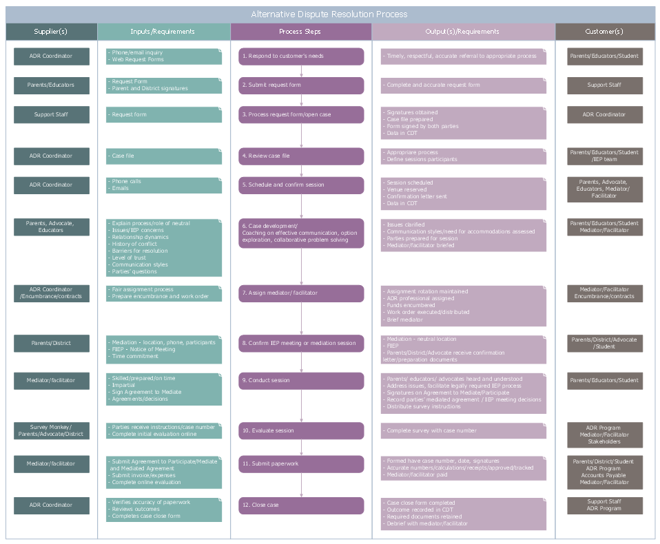
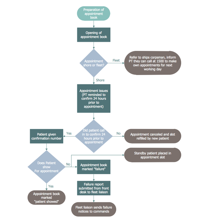
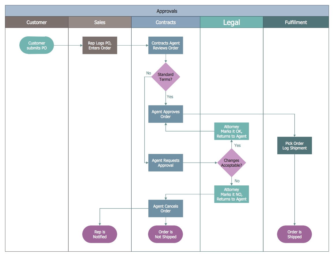
Flow charts are common throughout business, as a way of representing steps in a process or workflow, shown on the page as boxes containing actions, instructions or decisions.
A run chart displays recorded data over a certain time period, where the X axis shows the passage of time, and data points are plotted along the graph as they are observed. The often show some form of measurable manufacturing output, making it possible to quickly identify outliers and shifts in scale and frequency.
These diagram tools have become invaluable to modern business, and with so many cases for their use, it's important that workers of all experience levels can produce clear and effective examples that can be shared across a team and understood at a glance.
CS Odessa are the first to bring all these techniques together under one office solution, and further extend the performance of their diagramming software, ConceptDraw PRO. The Seven Basic Tools of Quality solution provides an extensive set of vector stencil libraries and individual sample templates for each form of quality control diagram, allowing workers to chose which diagram works best for their situation without switching software or searching for multiple add-ons. To compliment the solution, CS Odessa have a dedicated online help resource, referencing specific quality diagram examples, teaching new users how to get started with their design, and offering tips and tricks to more experienced workers.
A company's success relies on quality assurance and quality output. With the Seven Basic Tools of Quality solution for ConceptDraw PRO, you have the diagramming power to reach that standard.
This is the essence of defining quality in the workplace, and the Seven Basic Tools of Quality were conceived as a generic, visual form of tackling these issues. They comprise of seven forms of diagram that are varied enough to be applied to any industry troubleshooting scenario, but simple enough that workers of all types can intuitively understand and implement them.
Despite the title, there are 3 possible options for the last diagram, making 9 in total:
Fishbone diagram
So named because they resemble the bone structure of a fish, fishbone diagrams are also known as Ishikawa diagrams, after their creator and quality control pioneer, Kaoru Ishikawa. Yet another name is a cause-and-effect diagram, and this better explains their purpose — you start with an identified problem, or effect, and work backwards to figure out every causal influence on that effect.
Check sheet
Check sheets are a simple way of making sure that a quality process is followed and standards are followed. They take the form of a grid, where each row is a step that must be checked off in real time as data is gathered.

A check sheet made using ConceptDraw PRO, that takes note of faulty car parts
Control chart
A control sheet records a certain statistic at different times throughout the day, and applies to it a mean data range. If data values fall well outside that range, it could be a sign of an inefficiency or some flaw in a business process.
Histogram
A histogram is used to show the frequency distribution of a specific variable. Visually, they are arranged something like bar charts, but differ in that they don't compare disparate sets of data against each other — instead they take one value, and show its frequency within predefined intervals.
Pareto chart
Pareto charts combines both a bar chart and a line graph, where the bar chart shows individual data values, and a cumulative total represented by the line. In quality control, it is a way of spotting the largest source of defects, complaints, flaws and so on.

This ConceptDraw PRO designed Pareto chart shows the frequency of each type of defect
Scatter diagram
By plotting against an X and Y axis, a scatter graph can show two variables of a set of data. You can then ascertain the relationship between the variables by how the data points are clustered on the diagram.
Stratification diagram
Stratification is a means of taking data from different sources, and instead of viewing it as a single group, the data is separated by source so as better to identify patterns. To make the data even more representative, the sample size changes according to source.
Made using ConceptDraw PRO, this stratification chart distinguishes sources by icon shape
Flow chart
Flow charts are common throughout business, as a way of representing steps in a process or workflow, shown on the page as boxes containing actions, instructions or decisions.
Run chart
A run chart displays recorded data over a certain time period, where the X axis shows the passage of time, and data points are plotted along the graph as they are observed. The often show some form of measurable manufacturing output, making it possible to quickly identify outliers and shifts in scale and frequency.
These diagram tools have become invaluable to modern business, and with so many cases for their use, it's important that workers of all experience levels can produce clear and effective examples that can be shared across a team and understood at a glance.
CS Odessa are the first to bring all these techniques together under one office solution, and further extend the performance of their diagramming software, ConceptDraw PRO. The Seven Basic Tools of Quality solution provides an extensive set of vector stencil libraries and individual sample templates for each form of quality control diagram, allowing workers to chose which diagram works best for their situation without switching software or searching for multiple add-ons. To compliment the solution, CS Odessa have a dedicated online help resource, referencing specific quality diagram examples, teaching new users how to get started with their design, and offering tips and tricks to more experienced workers.
A company's success relies on quality assurance and quality output. With the Seven Basic Tools of Quality solution for ConceptDraw PRO, you have the diagramming power to reach that standard.