Just the image of a great meal, with fresh, tasty ingredients, will get most of us salivating in anticipation. We are hooked on TV shows from top chefs — Jamie Oliver and Nigella Lawson guide us through delicious recipes that can be made right at home, and release cookbooks bursting with glossy food imagery. Advertisements use the best lighting and angles to present towering plates of tempting treats. Restaurants and fast-food joints add pictures of their best dishes to the menu — even if what you see isn't always exactly what you get!

ConceptDraw PRO and the Cooking Recipes solution allows you to create food illustrations for any occasion
While three square meals a day is still held as a traditional standard by many, inventive foodies the world over have found the ways and means to squeeze in extra snacks and nibbles into the gaps between breakfast, lunch and dinner. Dedicated eaters can enjoy Tiffin, brunch or elevenses as a second morning meal, go for Yum cha or take high tea in the afternoon, and follow dinner with supper or a midnight feast. Geographical context can also be important — in the UK for instance, depending on the area, tea, dinner and supper can all refer to the same meal, or describe three separate mealtimes traditionally offering different types of dishes.
We have created the dish for every occasion. A wedding or a birthday demands a frosted cake; Christmas and Thanksgiving wouldn't be complete without roasted turkey and vegetables. A chef can spend their whole career dedicated to a single discipline — baking bread, carving sushi, curing meat — or dabble in an endless variety of combinations, cooking up entrées, amuse-bouches, desserts, haute cuisine, soups, pastries and petits fours, sometimes all for the same meal! The best chefs have never been afraid to innovate in order to create something truly memorable — Heston Blumenthal for instance can count snail porridge, meat fruit, and egg and bacon ice cream among his signature dishes.
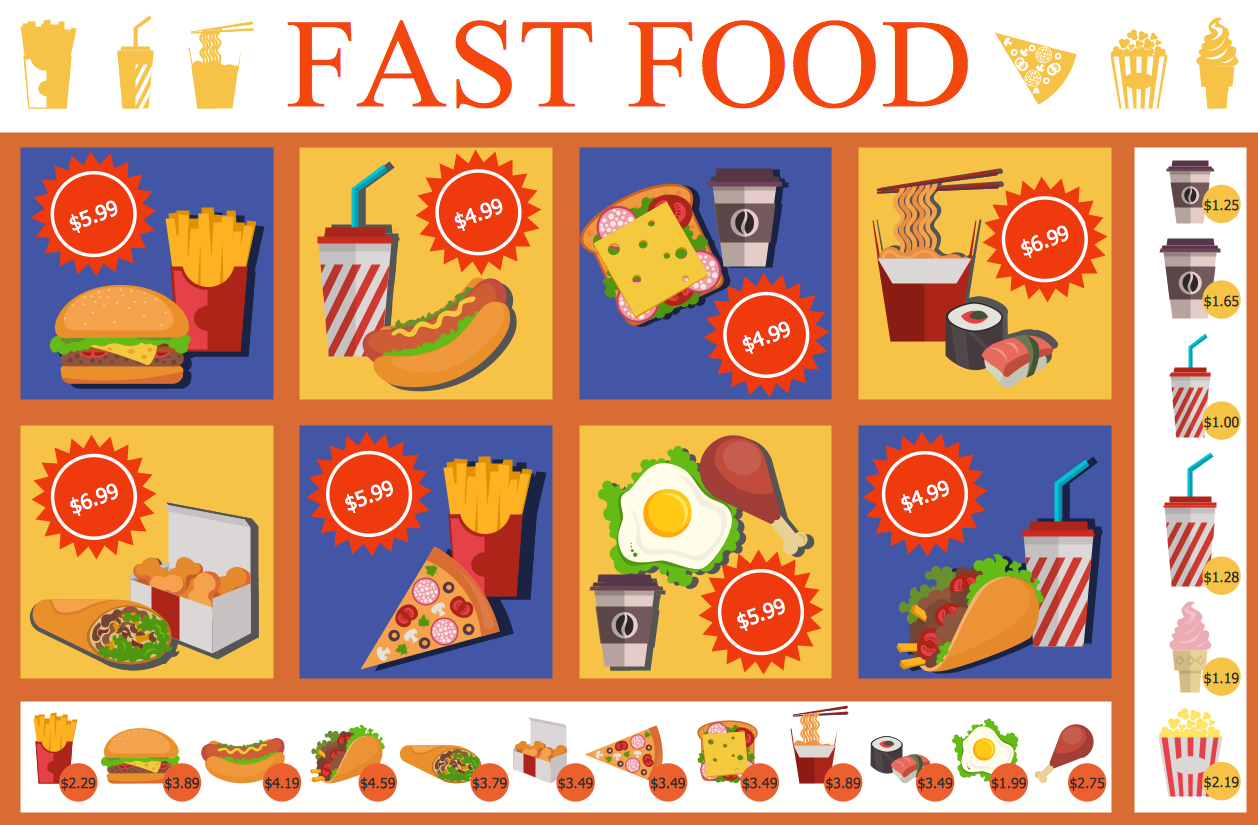
There is an idea that part of our eating is done with the eyes — this is why the concept of plate presentation exists, why cookbook add pictures of the finished dish alongside their recipes, why a fast food outlet covers their walls with stock images of their most popular takeouts. Certain studies have been conducted that involve participants eating 'blind', suggesting the importance of visual cues to ascertain the nutritional value of the food in front of us — supposedly our mind can filter information regarding portions, fat content and carbohydrate levels with the quickest of glances.

Add graphics to your tasty recipe ideas with ConceptDraw PRO
It's a useful trick, and perhaps describes partly why posters or presentations containing healthy eating infographics are so popular and effective, or why certain restaurants favour big bold images over simple plain text.
For best results when creating food recipe graphics, infographics or presentations, as well as accompanying illustrations for all dicing and slicing, mashing and juicing, or grating and baking utensils and cookware, it's best to use full featured drawing software such as ConceptDraw PRO, in conjunction with its specialist Cooking Recipes solution. Along with the benefits of quick and easy graphic design that comes when using PRO, the Cooking Recipe solution offers a custom made selection of vector stencil libraries, covering a vast range of food items and kitchen props. From breakfast to dinner, starter to dessert, the solution contains a cuisine graphic for any situation, to help you make bright, inventive food illustrations.

The Bread and Baking icon library from the Cooking Recipes solution
To assist with your culinary efforts, the ConceptDraw website offers a selection of learning tools and help media that ensure users can turn food recipe concepts into striking imagery in a simple and intuitive manner. You can find a huge resource of how-to articles, instructional videos, and FAQs that give an in-depth look into ConceptDraw PRO, and its many solutions. With the Cooking Recipes solution, it's an opportunity to turn mouth-watering recipes into a feast for the eyes.
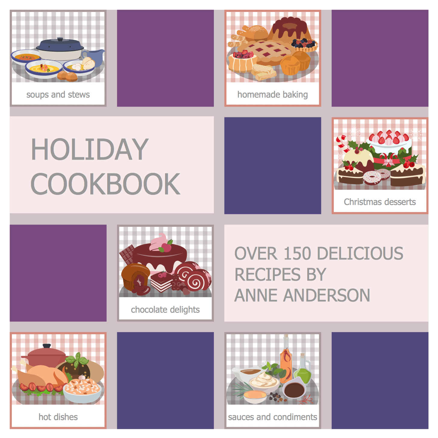
ConceptDraw PRO and the Cooking Recipes solution allows you to create food illustrations for any occasion
While three square meals a day is still held as a traditional standard by many, inventive foodies the world over have found the ways and means to squeeze in extra snacks and nibbles into the gaps between breakfast, lunch and dinner. Dedicated eaters can enjoy Tiffin, brunch or elevenses as a second morning meal, go for Yum cha or take high tea in the afternoon, and follow dinner with supper or a midnight feast. Geographical context can also be important — in the UK for instance, depending on the area, tea, dinner and supper can all refer to the same meal, or describe three separate mealtimes traditionally offering different types of dishes.
We have created the dish for every occasion. A wedding or a birthday demands a frosted cake; Christmas and Thanksgiving wouldn't be complete without roasted turkey and vegetables. A chef can spend their whole career dedicated to a single discipline — baking bread, carving sushi, curing meat — or dabble in an endless variety of combinations, cooking up entrées, amuse-bouches, desserts, haute cuisine, soups, pastries and petits fours, sometimes all for the same meal! The best chefs have never been afraid to innovate in order to create something truly memorable — Heston Blumenthal for instance can count snail porridge, meat fruit, and egg and bacon ice cream among his signature dishes.
There is an idea that part of our eating is done with the eyes — this is why the concept of plate presentation exists, why cookbook add pictures of the finished dish alongside their recipes, why a fast food outlet covers their walls with stock images of their most popular takeouts. Certain studies have been conducted that involve participants eating 'blind', suggesting the importance of visual cues to ascertain the nutritional value of the food in front of us — supposedly our mind can filter information regarding portions, fat content and carbohydrate levels with the quickest of glances.

Add graphics to your tasty recipe ideas with ConceptDraw PRO
It's a useful trick, and perhaps describes partly why posters or presentations containing healthy eating infographics are so popular and effective, or why certain restaurants favour big bold images over simple plain text.
For best results when creating food recipe graphics, infographics or presentations, as well as accompanying illustrations for all dicing and slicing, mashing and juicing, or grating and baking utensils and cookware, it's best to use full featured drawing software such as ConceptDraw PRO, in conjunction with its specialist Cooking Recipes solution. Along with the benefits of quick and easy graphic design that comes when using PRO, the Cooking Recipe solution offers a custom made selection of vector stencil libraries, covering a vast range of food items and kitchen props. From breakfast to dinner, starter to dessert, the solution contains a cuisine graphic for any situation, to help you make bright, inventive food illustrations.
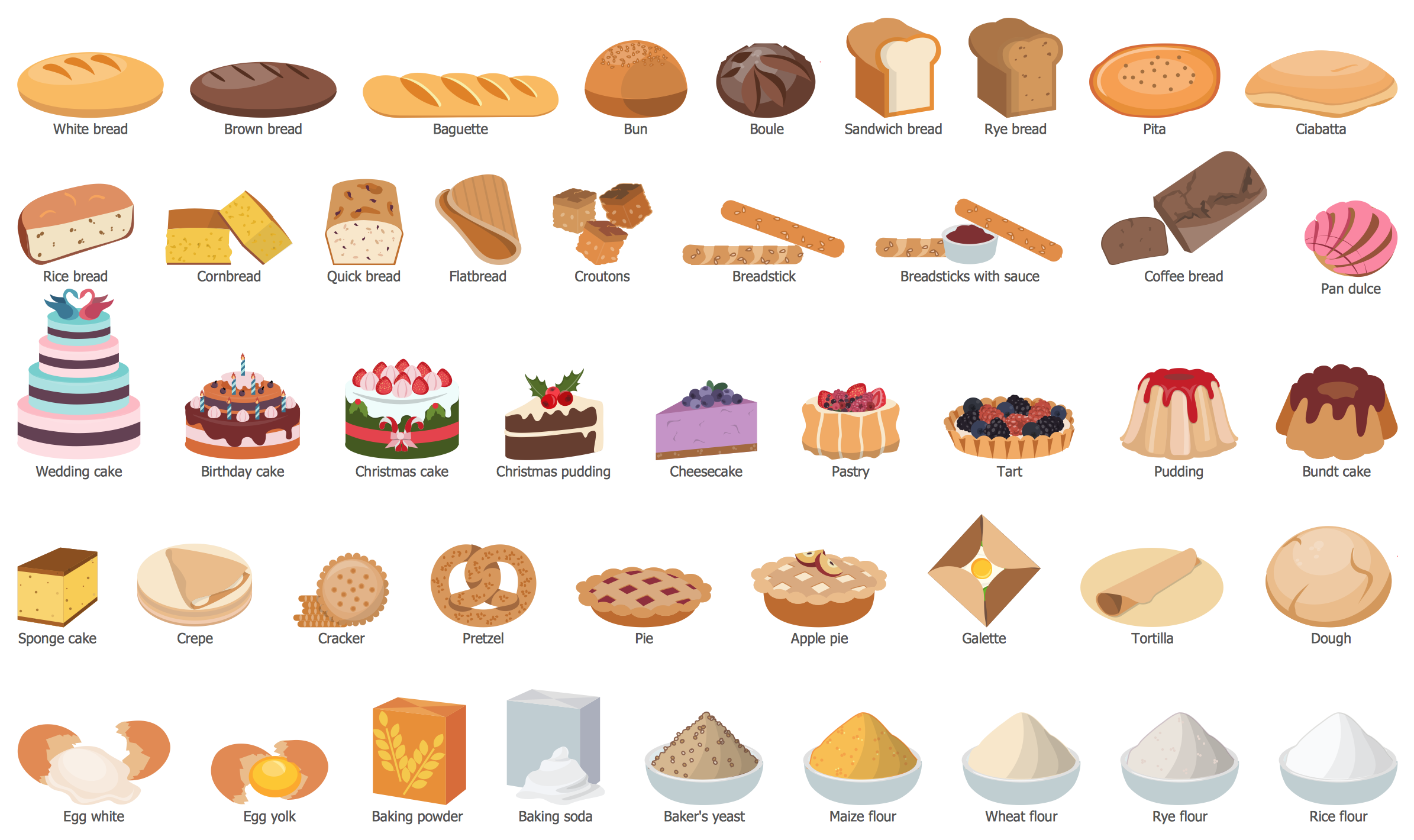
The Bread and Baking icon library from the Cooking Recipes solution
To assist with your culinary efforts, the ConceptDraw website offers a selection of learning tools and help media that ensure users can turn food recipe concepts into striking imagery in a simple and intuitive manner. You can find a huge resource of how-to articles, instructional videos, and FAQs that give an in-depth look into ConceptDraw PRO, and its many solutions. With the Cooking Recipes solution, it's an opportunity to turn mouth-watering recipes into a feast for the eyes.