Monday, September 26, 2016

UML diagrams as a tool for a software development team

As we progress into the 21st century, our reliance on computer and information systems to facilitate business is greater than ever before. The global market is much too convoluted and relentless to be run on manpower and note-taking alone; software systems are crucial to a company when handling large amounts of data processing, customer transactions, or client databases. As such, their development and maintenance has become a key component in successful company operations.

To structure, plan, and control the development of these systems, a software development life cycle (SDLC) is developed and adhered to. Different methodologies have evolved to be applied for different purposes, based on technical, organizational, project and team needs, but generally all will use some combination of the following stages:

  • Problem analyzing
  • Market research
  • Requirements analysis
  • Design
  • Implementation (coding)
  • Testing
  • Deployment
  • Maintenance and bug fixing 

How strictly this order is followed, and what level of planning and documentation is reached, will depend on the requirements of the business and capabilities of the software. A 'waterfall' approach to the SDLC would see each of these stages carried out in linear order, with detailed planning and risk assessment before coding is even begun. The 'extreme' approach involves a lot less planning and documentation, and focuses more on coding and continuous re-testing, ideal for a smaller system, or one where new components are being added as an ongoing process.


Modeling software development using UML diagrams


While going through each stage of the SLDC, it can be useful, and necessary, to produce a visual model of that process. A diagram of this kind presents a graphical view of a software system's structure, components and relationships, which allows the designer to organize and predict certain outcomes, as well as share system information with collaborators and clients.

The accepted standard used when modeling a system is known as Unified Modeling Language (UML), a generic set of notations that are used when creating UML diagrams. These notations can visually represent requirements, subsystems, logical and physical elements, and structural and behavioral patterns, that are especially relevant to systems built using an object-oriented style.

Using UML during the modeling process has a number of benefits — for one, the entire development team can share information and collaborate using common language, diagrams and software, something that's not possible when using a more task-specific programming language. It allows team members to create system 'blueprints', creating diagrams that show system as a unified whole, but also allowing the option to break that system down into component parts or processes.

Currently on version 2.5, UML supports 14 different diagram techniques that are seen as industry standard. These diagrams are broadly divided into two categories; first are static structure diagrams, that describe the physical structure of a system. Then there are behavior diagrams, that depict behaviors and interactions of various system components. Here is a brief description what each diagram is and how it can be applied:


Static structure diagrams


Class diagrams — divides objects into 'classes', i.e. parts that share common attributes. Class defines the methods and variables of that object, and diagrams depict relationships and source code dependencies between them.


Component diagrams — displays system components (physical or logical), interfaces and ports, and the connections between them. Allows analysts to replace and system check individual parts rather than designing the process from scratch.

Composite structure diagrams — shows the internal structure of a specific class, the role each element plays in collaboration with others, and how this affects how the class interacts with outside elements.

Deployment diagrams — models the physical deployment of artefacts (software systems) on nodes (normally hardware, e.g. laptop, mobile phone). Execution environment nodes are a 'node within a node', a software computing resource that displays hardware characteristics.

Object diagrams — represent a system overview. Similar to a class diagram, the take a snap-show of a system structure at a particular moment in time.

Package diagrams — packages are formed when UML elements are grouped together - classes, objects, use cases, components or nodes. A package diagram shows this grouping, and dependencies between packages that make up a system. An example of use would be when modeling complex source code; packages are used to represent the different layers of code.


Profile diagrams — operates at the metamodel level to show stereotypes as classes, and profiles as packages. Allows the developer to create custom packages.

Behavior diagrams


Activity diagrams — can be said to resemble a flowchart, showing steps in a software process as a workflow. Binary choices from each step, yes/no, true/false, make this a useful medium to describe software and coding logic.

State machine diagrams — describes the current state of a machine, which values are acting upon it. It shows what actions the nodes of a software system take, dependent on explicit events.

Use case diagrams — shows an actual example of system usage. Helps define requirements for a software system, and can describes any possible form of interactions between users and that system.

Interaction diagrams


Communication diagrams — displays the interaction between objects in terms of a set of sequenced messages. It's used to create a birds-eye view of the collaboration between several objects, for a common purpose within the system.

Interaction overview diagrams — like an activity diagram in that it shows a workflow through a system, but simplifies complex patterns by making each step a nest of interactions within the larger overview of an activity.

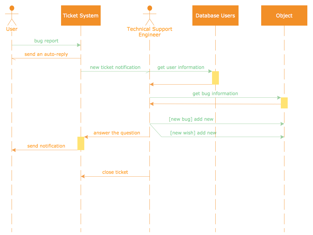
Sequence diagrams — useful to describe object interactions in a specific time sequence. Can consist of parallel 'life lines' that depict an objects state at any given moment, and the sequence of time ordered events that affect that state. From a software perspective, developers use this diagram can show simple runtime scenarios


Timing diagram — depicts the behaviours of a given set of objects through a certain period of time.

ConceptDraw as a modeling tool


ConceptDraw is dedicated to providing system designers and specialists with the optimum tools required to create diagrams in a coherent and efficient manner, maximising possible output to keep up with the designer's speed of thought. The Rapid UML solution for ConceptDraw PRO was created with this aim in mind. Now UML diagrams can be created with the help of RapidDraw functionality, technology created by ConceptDraw that allows you to spawn each new step of a process with a single click of a button, as opposed to dragging, dropping and arranging each individual element of a diagram. This intuitive interface takes a lot of the workload from the designer, allowing them to focus on the more creative aspects of their tasks.

The Rapid UML solution consists of numerous vector stencil libraries, containing the generic icons of the Unified Modeling Language. All graphics are professionally designed to adhere to industry standards, meaning UML diagrams created with ConceptDraw will be understood universally, and applicable for design purposes, presentations, or communicating ideas and defining requirements with other collaborators or end-users.

While acting an extremely useful and comprehensive tool for dedicated software specialists, ConceptDraw also provides tools and assistance for any level of user, looking to create diagrams of any complexity. This introductory video guide describes gives a basic overview of the Rapid UML solution itself, while the steps needed to create a basic diagram are shown here. As part of the large video library found in ConceptDraw's help section, this short clip guides a user step by step through creating a UML diagram, giving visual aids and showing the capacity of the solution. Also found within the solution, are templates that provide users with a framework from which to start their diagram.

The Rapid UML solution is another high functioning, comprehensive solution from ConceptDraw, that pulls together a vast amount of material to help system analysts and designers create professional looking, standardized UML diagrams.


Thursday, March 10, 2016

Germany Maps

Germany is a federal republic made up of sixteen federal states. After notable periods of political upheaval over the last century, since the fall of the Berlin Wall and the re-unification of East and West Germany, the geographical borders of these states have remained stable and unchanged. For administrative purposes, these states are further divided into governmental districts, rural or urban districts, and municipalities.

Of the sixteen states, three are known as 'city states', covering the populous cities of Hamburg, Berlin and Bremen. The other thirteen are termed 'area states', and cover a larger geographic area. The full list is as follows:

  •     Baden-Württemberg
  •     Bavaria
  •     Berlin
  •     Brandenburg
  •     Bremen
  •     Hamburg
  •     Hesse
  •     Lower Saxony
  •     Mecklenburg-Western Pomerania
  •     North Rhine-Westphalia
  •     Rhineland-Palatinate
  •     Saarland
  •     Saxony
  •     Saxony-Anhalt
  •     Schleswig-Holstein
  •     Thuringia


Map of Germany states

Using thematic maps is a natural way to represent geographical data about a specific region. There are a number of common methods used by cartographers — a choropleth map for example would use the basic outlines of Germany and its constituent states to show the prevalence of specific data within these regions. Within these types of map, differences in qualitative data are shown by different colour hues, while quantitative data is represented by different hues of a single colour.

Other thematic map variants include proportional maps, where symbols of different sizes represent the value of data in that area, or dot distribution maps, where a dot is placed to signify each occurrence of a particular phenomenon. Methods such as these provide a quick at-a-glance review of what can be numerous or complex data sets.


Thematic Map was created with ConceptDraw PRO, it shows detailed maps for each of Germany's states, and vice versa extensive maps depicting Germany as a part of EU on the map of Europe

Using the diagramming software ConceptDraw PRO, in conjunction with the Germany Maps solution, gives users a powerful set of tools that allows them to quickly and intuitively create thematic maps based on Germany's national and district borders. The solution contains a professionally drawn map of Germany, with the ability to toggle the display of state borders and major cities, allowing further layers of detail to be added. As is common with ConceptDraw solutions, a number of templates and samples are provided to spark creativity and give map and infographic designers a solid base to start working from.

The ConceptDraw website provides in-depth learning materials and a comprehensive help desk, including video tutorials, FAQs, and how-to guides with simple to follow steps for the best possible results. Expand the borders of map and infographic design with the Germany Maps solution for ConceptDraw PRO.

Tuesday, February 2, 2016

UK and Ireland Maps


Despite their relatively small size, the United Kingdom and Ireland are host to a wide variety of social and geographical features, and an intricate system of country borders, county lines and regional communities. Depending on your perspective and preference, a number of names can mean the same thing — the UK refers to four countries united — Northern Ireland, Scotland, Wales and England. Great Britain includes just the latter three. Quite often however, patriots will proudly refer to their home nation by its individual name. To describe all the islands together, including smaller semi autonomous areas such as the Isle of Mann or the Channel Islands, the term British Isles is used.

British Isles


For administrative and political purposes, each country is divided into a number of counties, which are then further subdivided into districts. In England these county borders are ever changing — so much so that there are two interpretations of the map. The 'ceremonial' counties have their roots in the original outlines set in the Middle Ages. The newer borders reflect changes in politics and a growing population, including a number of 'metropolitan' counties that typically cover a small but densely populated region — Greater London is one such example. The other countries of the UK, and Ireland, employ a similar system.

UK map of cities and towns in wales was created with ConceptDraw PRO, it shows map of England with the most important and largest cities


A varied social landscape makes the British Isles an ideal candidate for various types of thematic map — a visual way of studying different points of interest and geographical data. Using land or political borders as a base, and referencing major towns and cities, it's possible to apply certain subject matter to a map to create an at-a-glance view showing particular data distribution across the land. For instance, although English is the most common language across the Isles, a thematic map might show concentrations of Welsh speakers in Wales, or those who practice Gaelic in Ireland or Scotland. From a political perspective, county borders can be used to show which areas traditionally vote Labour or Conservative at election time.

Thematic maps come under the larger scope of geospatial infographics. Infographics are in common usage throughout business, often providing some angles on sales or logistics. It's important to know which products are popular in which region, and just as important to organize their distribution. Geospatial infographics can provide information for any number of industries, including utilities, natural resources, public safety, road networks or social science, and many more.

An ideal platform for users needing to generate thematic maps and infographics is ConceptDraw PRO, extended with the UK and Ireland Maps solution. With this diverse diagramming tool and solution, you are provided with professionally drawn outlines of the British Isles, giving knowledge workers a quick start for any thematic designs they might need to produce.

Map graphics can be toggled to show regional borders and major cities, and also included are a number of samples and templates of common infographic ideas. As with all their solutions, ConceptDraw provide comprehensive training videos and supporting texts on their website, helping users new to ConceptDraw PRO become comfortable with the many features available. One of these features is the ability to export diagrams in a number of graphical formats — ideal for collaboration in a business setting.

The UK and Ireland Map solution for ConceptDraw PRO opens up new borders for diagramming possibilities.

Tuesday, January 12, 2016

Health Food Infographics


While there has always been an abundance of fad diets and miracle slimming cures taking advantage of the latest trends, healthy eating and a well rounded diet is more about a lifestyle choice — the process of keeping body and mind in optimum condition. The key is to reach a balance with your eating habits — you don't have to starve yourself, or cut out all enjoyment from food, just plan a diet with the correct proportion of all the nutrients your body needs.

There is no single way to do this, but all nutritional specialists agree on the fundamentals that we need provide our body with each day:

Carbohydrates:

These are the 'energy' foods, and should provide the base for most meals. They include starchy foods such as cereals, pasta, rice, potatoes or bread. For the most effective nutrition, they should be in wholegrain form whenever possible.

Protein:

Protein keeps all the body processes running smoothly, and helps build and repair cells. It can be found in lean meat, poultry, fish, beans, nuts, seeds and eggs.

Fats:

Unsaturated fats are important as a secondary energy source, and are found in certain oils, nuts, avocados, and various types of fatty fish. The health effects of saturated fats are disputed, but in any case it's probably best to limit the intake of things like ice-cream, butter, cheese and red meat.

Vitamins and minerals:

These help with numerous physiological functions — for example calcium and vitamin D help build strong bones, while vitamin C is good for healthy skin. They exist in some aspect in most foods; a great source is through a wide selection of fruit and vegetables.

Water:

While people can go for weeks without food in extreme situations, you can only survive a few days without water. It is essential for the distribution of other nutrients around the body, and to keep vital organs hydrated.

As long as a diet contains a balance of each of these nutrients, it is largely down to personal preference as to where they come from. For instance many people will get the majority of their protein from certain meats or fish, while the main source for a vegetarian will be dishes based on beans, nuts or seeds. Organic foods have many supporters — the supposition is that they are healthier and richer in nutrients than foods that have been processed with synthesized chemicals or other additives.


The Grains, Beans, Legumes, Nuts icon library from the Healths Food solution

If people don't feel their diet is providing all the essentials, or for those with underlying medical conditions, dietary supplements can be used to make up the shortfall. These include pills that cover the whole vitamin spectrum, fatty acids, amino acids, or herbal supplements. Sportsmen or bodybuilders have a whole range of protein supplements available to help with training and stimulate muscle growth — these are commonly in the form of powders that are mixed into drinks, and contain ingredients such as whey, creatine or glutamine.

One of the more effective ways of presenting information on healthy eating and food nutrition is through visual mediums, such as charts, diagrams or infographics. One of the most famous examples is the 'food pyramid' infographic. In this diagram, pictures of various types of food are contained within a levelled pyramid, with the widest base level showing the starchy foods that should make up the majority of a diet, tapering to treats and sweets at the top that should be eaten very sparingly.


Healths Food Infographics — Food Pyramid

Infographics are a great tool for conveying simple messages through a combination of text and visuals. Healthy food illustrations can be accompanied by information regarding the nutrients that can be found within; graphics showing balanced meal options can give people ideas for a weekly diet plan.

To help easily create infographics and diagrams of this nature, business software provider ConceptDraw has added the Health Food solution to its Solution Park, extending ConceptDraw PRO's functionality with vector stencil libraries of healthy eating options, samples of finished graphics, and a number of templates to help users get started with their own designs.

To ensure the best results, the ConceptDraw website provides a wide variety of help and learning materials, including video tutorials, FAQs, and how-to guides, allowing users to present their nutritional messages effectively and professionaly.

Thursday, December 17, 2015

Visualizing Cooking Recipes

Just the image of a great meal, with fresh, tasty ingredients, will get most of us salivating in anticipation. We are hooked on TV shows from top chefs — Jamie Oliver and Nigella Lawson guide us through delicious recipes that can be made right at home, and release cookbooks bursting with glossy food imagery. Advertisements use the best lighting and angles to present towering plates of tempting treats. Restaurants and fast-food joints add pictures of their best dishes to the menu — even if what you see isn't always exactly what you get!


ConceptDraw PRO and the Cooking Recipes solution allows you to create food illustrations for any occasion

While three square meals a day is still held as a traditional standard by many, inventive foodies the world over have found the ways and means to squeeze in extra snacks and nibbles into the gaps between breakfast, lunch and dinner. Dedicated eaters can enjoy Tiffin, brunch or elevenses as a second morning meal, go for Yum cha or take high tea in the afternoon, and follow dinner with supper or a midnight feast. Geographical context can also be important — in the UK for instance, depending on the area, tea, dinner and supper can all refer to the same meal, or describe three separate mealtimes traditionally offering different types of dishes.

We have created the dish for every occasion. A wedding or a birthday demands a frosted cake; Christmas and Thanksgiving wouldn't be complete without roasted turkey and vegetables. A chef can spend their whole career dedicated to a single discipline — baking bread, carving sushi, curing meat — or dabble in an endless variety of combinations, cooking up entrées, amuse-bouches, desserts, haute cuisine, soups, pastries and petits fours, sometimes all for the same meal! The best chefs have never been afraid to innovate in order to create something truly memorable — Heston Blumenthal for instance can count snail porridge, meat fruit, and egg and bacon ice cream among his signature dishes.

There is an idea that part of our eating is done with the eyes — this is why the concept of plate presentation exists, why cookbook add pictures of the finished dish alongside their recipes, why a fast food outlet covers their walls with stock images of their most popular takeouts. Certain studies have been conducted that involve participants eating 'blind', suggesting the importance of visual cues to ascertain the nutritional value of the food in front of us — supposedly our mind can filter information regarding portions, fat content and carbohydrate levels with the quickest of glances.


Add graphics to your tasty recipe ideas with ConceptDraw PRO

It's a useful trick, and perhaps describes partly why posters or presentations containing healthy eating infographics are so popular and effective, or why certain restaurants favour big bold images over simple plain text.

For best results when creating food recipe graphics, infographics or presentations, as well as accompanying illustrations for all dicing and slicing, mashing and juicing, or grating and baking utensils and cookware, it's best to use full featured drawing software such as ConceptDraw PRO, in conjunction with its specialist Cooking Recipes solution. Along with the benefits of quick and easy graphic design that comes when using PRO, the Cooking Recipe solution offers a custom made selection of vector stencil libraries, covering a vast range of food items and kitchen props. From breakfast to dinner, starter to dessert, the solution contains a cuisine graphic for any situation, to help you make bright, inventive food illustrations.


The Bread and Baking icon library from the Cooking Recipes solution

To assist with your culinary efforts, the ConceptDraw website offers a selection of learning tools and help media that ensure users can turn food recipe concepts into striking imagery in a simple and intuitive manner. You can find a huge resource of how-to articles, instructional videos, and FAQs that give an in-depth look into ConceptDraw PRO, and its many solutions. With the Cooking Recipes solution, it's an opportunity to turn mouth-watering recipes into a feast for the eyes.


Friday, November 20, 2015

The Seven Basic Tools of Quality

Every business wants to run at its most efficient equilibrium, with maximum productivity from its workers, cost effective product design and manufacture, and smart strategic decision making regarding managements and HR processes. For this to occur there must be a constant monitoring of business activity, a way of breaking down an organization into its component parts in such a way that they can be analyzed and refined, where any faults, inefficiencies, or redundant processes can be determined and dealt with.

This is the essence of defining quality in the workplace, and the Seven Basic Tools of Quality were conceived as a generic, visual form of tackling these issues. They comprise of seven forms of diagram that are varied enough to be applied to any industry troubleshooting scenario, but simple enough that workers of all types can intuitively understand and implement them.

Despite the title, there are 3 possible options for the last diagram, making 9 in total:

Fishbone diagram


So named because they resemble the bone structure of a fish, fishbone diagrams are also known as Ishikawa diagrams, after their creator and quality control pioneer, Kaoru Ishikawa. Yet another name is a cause-and-effect diagram, and this better explains their purpose — you start with an identified problem, or effect, and work backwards to figure out every causal influence on that effect.

Check sheet


Check sheets are a simple way of making sure that a quality process is followed and standards are followed. They take the form of a grid, where each row is a step that must be checked off in real time as data is gathered.


A check sheet made using ConceptDraw PRO, that takes note of faulty car parts

Control chart


A control sheet records a certain statistic at different times throughout the day, and applies to it a mean data range. If data values fall well outside that range, it could be a sign of an inefficiency or some flaw in a business process.

Histogram


A histogram is used to show the frequency distribution of a specific variable. Visually, they are arranged something like bar charts, but differ in that they don't compare disparate sets of data against each other — instead they take one value, and show its frequency within predefined intervals.

Pareto chart


Pareto charts combines both a bar chart and a line graph, where the bar chart shows individual data values, and a cumulative total represented by the line. In quality control, it is a way of spotting the largest source of defects, complaints, flaws and so on.


This ConceptDraw PRO designed Pareto chart shows the frequency of each type of defect

Scatter diagram


By plotting against an X and Y axis, a scatter graph can show two variables of a set of data. You can then ascertain the relationship between the variables by how the data points are clustered on the diagram.

Stratification diagram


Stratification is a means of taking data from different sources, and instead of viewing it as a single group, the data is separated by source so as better to identify patterns. To make the data even more representative, the sample size changes according to source.

Made using ConceptDraw PRO, this stratification chart distinguishes sources by icon shape

Flow chart


Flow charts are common throughout business, as a way of representing steps in a process or workflow, shown on the page as boxes containing actions, instructions or decisions.

Run chart


A run chart displays recorded data over a certain time period, where the X axis shows the passage of time, and data points are plotted along the graph as they are observed. The often show some form of measurable manufacturing output, making it possible to quickly identify outliers and shifts in scale and frequency.

These diagram tools have become invaluable to modern business, and with so many cases for their use, it's important that workers of all experience levels can produce clear and effective examples that can be shared across a team and understood at a glance.

CS Odessa are the first to bring all these techniques together under one office solution, and further extend the performance of their diagramming software, ConceptDraw PRO. The Seven Basic Tools of Quality solution provides an extensive set of vector stencil libraries and individual sample templates for each form of quality control diagram, allowing workers to chose which diagram works best for their situation without switching software or searching for multiple add-ons. To compliment the solution, CS Odessa have a dedicated online help resource, referencing specific quality diagram examples, teaching new users how to get started with their design, and offering tips and tricks to more experienced workers.

A company's success relies on quality assurance and quality output. With the Seven Basic Tools of Quality solution for ConceptDraw PRO, you have the diagramming power to reach that standard.


Thursday, November 5, 2015

Business Process Mapping

We use the phrase business process to define a particular set of tasks or actions undertaken by an organization, that lead to the production of goods or services for the customer base. It's a flexible term — one that can be used to describe the most menial or idiosyncratic of assignments, or as a way of describing a company in its entirety.

Critical study of each facet of a process is imperative for maintaining high standards within a company, and to allow management to spot any flaws or inefficiencies in its day-to-day business. The most common way of condensing a process down into an organized format is to use a visual solution — one that allows each point to be represented clearly and succinctly, giving those that are unfamiliar with the process an unambiguous interpretation of events.

To support this visual style of quality management, a number of transferable methodologies have been developed — generic diagramming solutions that act as a framework around which unique and disparate processes can be formed. The collective term for this practice is business process mapping, and here follows a brief description of some of the more popular approaches to it.

  • SIPOC Diagrams — SIPOC stands for suppliers, inputs, process, outputs, and customers, and it is a style of diagram that has a clear focus on the quality of what is going in, and what is being produced from a business process. It has a simple visual form, a segmented table that produces comprehensive lists for each category. With a SIPOC diagram, the start and end of a process is clearly defined, and the relationship between a company and its external suppliers is easily identified. SIPOC diagrams form a key part of the Six Sigma methodology, which are a set of techniques and tools to help improve quality output and minimize variability within repeated tasks.


A SIPOC diagram created with ConceptDraw PRO, showing all elements involved in hiring a candidate

  • Business process flowcharts — A flowchart is the go-to tool for representing any basic process that involves a series of steps or decisions, particularly processes that are repeatable. Also known as a process flow diagram, these charts act as a solution model to a given problem, telling the user exactly which steps can be taken at what time, and the impact of choices made within the workflow. As with SIPOC diagrams, a flowchart can show the input and output of materials and services in terms of the customer, as well as being used to define processes from other areas of a company, such as management or human resources.


Flowcharts show repeated processes, like this sequence of doctor appointment procedure

  • Swimlane diagrams — If a business process crosses over multiple departments, in can be easier to define using a flowchart that has been divided into distinct sections, or 'swimlanes'. These lanes distinguish which persons, groups, or location influence a particular step of the business process. They are useful for explicitly stating each stakeholders responsibility, and the actions each employee is expected to complete, before the process can continue to the next department. Other terms for these type of diagrams include 'deployment flowchart' and 'cross-functional flowchart'.


This swimlane diagram was created using ConceptDraw PRO, and shows the steps that each division is responsible for in a customer order

  • IDEF3 — The IDEF business process modelling language is used in slightly more specific scenarios than the previous examples. IDEF3 in particular is a scenario-driven description capture method, that has the ability to define the state of the same system or process under a variety of conditions. While flowcharts can allow a certain amount of artistic license in their design, IDEF3 uses standardized process schematic symbols — a more complex and comprehensive set of icons than found in flowcharts, and more precise in their definition.
  • Value stream mapping — A value stream map takes a wide look at the relationships between manufacturing, production control and shipping processes. They follow the value chain through an organization, from supply until it reaches the market. Like IDEF3, standardized notation is used to facilitate understanding between workers and workforces.
To achieve the professional standards required for these diagramming styles, it's best to use specialized drawing software, and a supply of the correct graphical notations. There are a number of software capable of this, but the only one that contains solutions for all the techniques listed above, extending and enhancing an already powerful diagramming platform, is ConceptDraw PRO. With the new Business Process Mapping solution, joining previous solutions such as IDEF Business Process Diagrams and Value Stream Mapping, ConceptDraw PRO offers a comprehensive selection of process mapping tools to aid quality management within an organization and help refine workflows.