When European explorers and settlers reached Australia's shores, they brought with them the style of social structure, politics and governance from their homelands. Early settlements became colonies, some of which would form the foundations of modern day Australian cities such as Sydney and Melbourne. These colonies began to divide the mainland (and certain surrounding islands) into distinct territories — initially their boundaries were ever-changing, but by the end of the 1800s they eventually settled with the formation of six states that have remained largely unchanged to this day.
With Australia no longer serving solely as a penal colony for British convicts, and more and more migrants reaching the country, population and infrastructure expanded rapidly, leading to a call to unify the individual territories under one flag. After some negotiations, the six member states were ratified under the Commonwealth of Australia, that although still holding strong ties with the United Kingdom, would be largely self governing. In the 120 years since this unification, the political map of Australia has been consistent; the following is a list of the six states that comprised the nation then and now:
There are also 3 self governing territories — Northern Territory, Jervis Bay Territory, and the Australian Capital Territory, which is something like the USA's Washington DC. Over the years, Australia has also grouped several island chains under the Commonwealth, resulting in seven extra external territories.
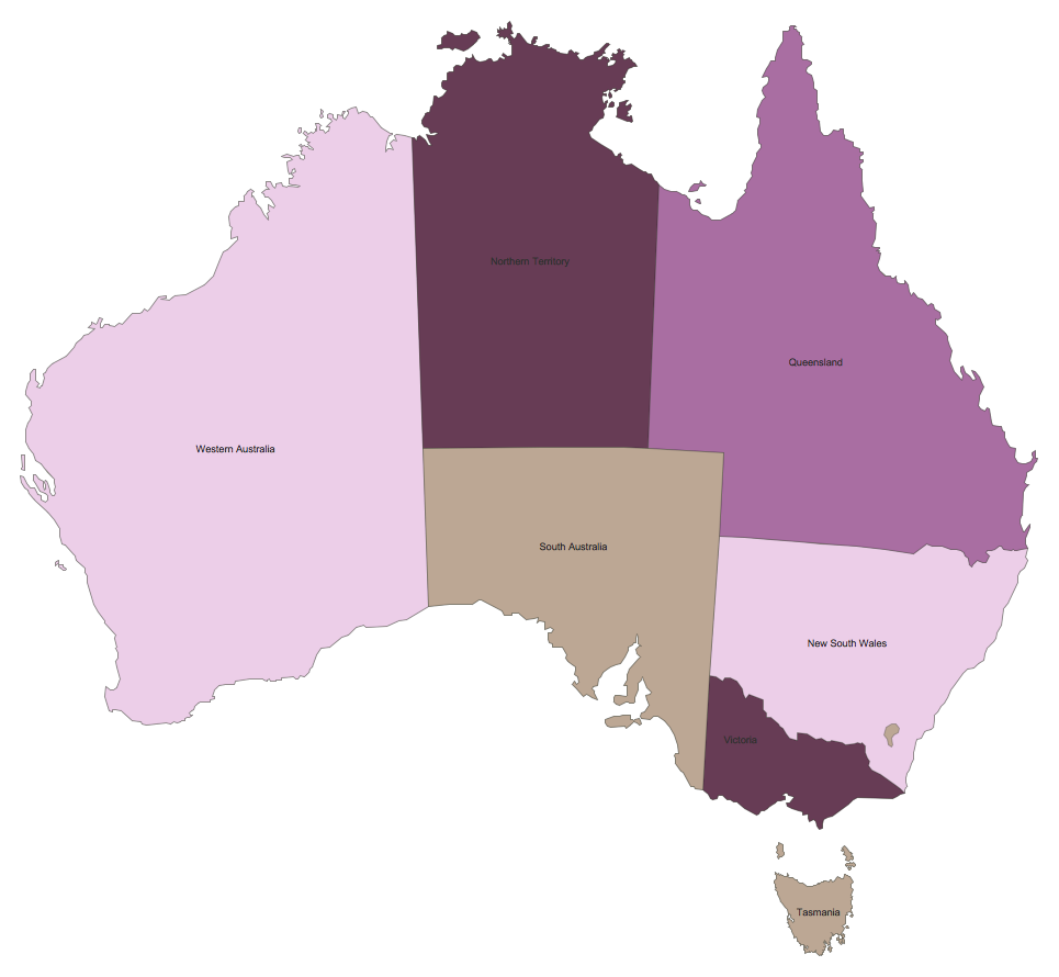
 Australian map was created with ConceptDraw PRO, it shows states and territories of Australia
The distinct and long standing territories, aligned with interesting geological features across a wide expanse, make thematic maps an ideal way of presenting geological, geographical or political information relating to Australia. A thematic map studies a particular theme or subject area in relation to a particular location — often the focus is on the distribution and spatial variation of whatever data is being analysed.
Thematic maps lack a certain level of detail — they often do not show features such as road networks or contours, but instead tend to use a basic political map as the foundation, with an added layer of data to give context. A common example is a map of population density. Using Australia in this instance, the map would consist of a basic outline with state borders, and some form of dot distribution to indicate population. The more dots condensed in one area, the more populous it is — looking at Australia we would see a large collection of dots spread along the (particularly South) coast, while the center of the map (the Australian Outback) would be relatively clear.
A geospatial infographic goes one step further than a thematic map, in that it can tackle a broader range of subjects and use a more dynamic visual style to get its message across. The idea behind an infographic is to tell the viewer a story about that subject, perhaps answering a posed question or using statistics to back up a more general statement. Rather than just focussing on one set of data, such as Australia's population density as used in the last example, an infographic can expand on linked causes and effects — health issues, pay disparities or political leanings for example.
There are few limits on how this information is presented, only that visual techniques are used to present the data in a way that is easily identifiable and understandable, and that a coherent argument is made.
The way geospatial and social data is collected now results in reams of data that is impenetrable to a casual viewer. Thematic maps and infographics have risen to prominence as effective ways of collating this data, and breaking it down into manageable pieces that are conducive to sharing through social media streams. At CS Odessa, we recognize the fact that working with complicated data while trying to express this creatively through original diagrams represents a challenge, particularly with the fast moving trends and deadlines that many are bound to. We constantly endeavour to provide the solutions to these problems.
The Australia Map solution for ConceptDraw PRO is our latest solution for knowledge workers and business people. We try and make every step of the creative process as simple and intuitive as possible. Inside the Australia Map solution you will find templates and samples to get you started, a library containing vector graphics representing each Australian state, and if you're still struggling for inspiration then there is our comprehensive help and video tutorial section to explain some tips and tricks. Used in conjunction with other ConceptDraw PRO solutions libraries, our vector graphics allow you to create rich and varied infographics along any theme. For a more concentrated map, these images allow extra levels of detail — you can choose to display your map with county borders, named geographical regions, and major towns and cities.
Once you've finished you design, we offer a full range of import and export capabilities, including exporting to different file formats, or sharing your creativity through presentations.
The Australia Map solution for ConceptDraw PRO is part of an ever-growing collection of visual solutions from CS Odessa — aiming to provide inspiration and productivity at every stage of the design process.
With Australia no longer serving solely as a penal colony for British convicts, and more and more migrants reaching the country, population and infrastructure expanded rapidly, leading to a call to unify the individual territories under one flag. After some negotiations, the six member states were ratified under the Commonwealth of Australia, that although still holding strong ties with the United Kingdom, would be largely self governing. In the 120 years since this unification, the political map of Australia has been consistent; the following is a list of the six states that comprised the nation then and now:
- South Australia
- New South Wales
- Queensland
- Victoria
- Western Australia
- Tasmania
There are also 3 self governing territories — Northern Territory, Jervis Bay Territory, and the Australian Capital Territory, which is something like the USA's Washington DC. Over the years, Australia has also grouped several island chains under the Commonwealth, resulting in seven extra external territories.
The distinct and long standing territories, aligned with interesting geological features across a wide expanse, make thematic maps an ideal way of presenting geological, geographical or political information relating to Australia. A thematic map studies a particular theme or subject area in relation to a particular location — often the focus is on the distribution and spatial variation of whatever data is being analysed.
Thematic maps lack a certain level of detail — they often do not show features such as road networks or contours, but instead tend to use a basic political map as the foundation, with an added layer of data to give context. A common example is a map of population density. Using Australia in this instance, the map would consist of a basic outline with state borders, and some form of dot distribution to indicate population. The more dots condensed in one area, the more populous it is — looking at Australia we would see a large collection of dots spread along the (particularly South) coast, while the center of the map (the Australian Outback) would be relatively clear.
A geospatial infographic goes one step further than a thematic map, in that it can tackle a broader range of subjects and use a more dynamic visual style to get its message across. The idea behind an infographic is to tell the viewer a story about that subject, perhaps answering a posed question or using statistics to back up a more general statement. Rather than just focussing on one set of data, such as Australia's population density as used in the last example, an infographic can expand on linked causes and effects — health issues, pay disparities or political leanings for example.
There are few limits on how this information is presented, only that visual techniques are used to present the data in a way that is easily identifiable and understandable, and that a coherent argument is made.
The way geospatial and social data is collected now results in reams of data that is impenetrable to a casual viewer. Thematic maps and infographics have risen to prominence as effective ways of collating this data, and breaking it down into manageable pieces that are conducive to sharing through social media streams. At CS Odessa, we recognize the fact that working with complicated data while trying to express this creatively through original diagrams represents a challenge, particularly with the fast moving trends and deadlines that many are bound to. We constantly endeavour to provide the solutions to these problems.
The Australia Map solution for ConceptDraw PRO is our latest solution for knowledge workers and business people. We try and make every step of the creative process as simple and intuitive as possible. Inside the Australia Map solution you will find templates and samples to get you started, a library containing vector graphics representing each Australian state, and if you're still struggling for inspiration then there is our comprehensive help and video tutorial section to explain some tips and tricks. Used in conjunction with other ConceptDraw PRO solutions libraries, our vector graphics allow you to create rich and varied infographics along any theme. For a more concentrated map, these images allow extra levels of detail — you can choose to display your map with county borders, named geographical regions, and major towns and cities.
Once you've finished you design, we offer a full range of import and export capabilities, including exporting to different file formats, or sharing your creativity through presentations.
The Australia Map solution for ConceptDraw PRO is part of an ever-growing collection of visual solutions from CS Odessa — aiming to provide inspiration and productivity at every stage of the design process.
No comments:
Post a Comment