Wednesday, July 29, 2015
Using Evernote with a Mind Map
Monday, July 20, 2015
Management Infographics
- Condense large amounts of information into an easily absorbable form
- Display data and information through use of visual elements
- Combine these elements to present an overriding message or insight
Visual
This covers the colours and graphics used on an infographic. Graphics can either represent specific pieces of data (theme graphics), or point towards particular areas of information (reference graphics).
Content
All the information you need to convey the main message. Facts, figures, and statistical breakdowns.
Knowledge
The marketing side of a business can use infographics to relay information and marketing strategies internally amongst the workforce, or as a tool to educate consumers about the business model or product.
Monday, July 13, 2015
Communicate visually
We can see visual presentation is intrinsic to conveying information for a variety of purposes. Here are some examples of the many forms that can be used, and their key design elements:
- Charts, graphs and matrices — useful in showing statistical data, and able to present results in multiple visual forms. Pie charts and bar charts show data as proportional to the size of the bar, or piece of pie. Line graphs are used to compare two variables, while scatter diagrams display data as a collection of points to show frequency of a certain value. A key tool for project managers is the Gantt chart — a project chart that gives a detailed rundown on project completion, resource allocation and budgetary requirements.
Fig. 3. MultiProject Dashboard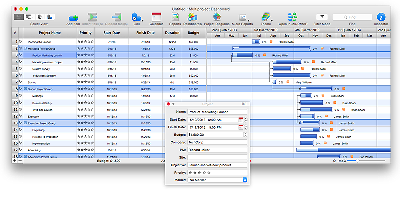
- Infographics — combines text with relevant icons and ideograms to illustrate a certain point or piece of information. They are a popular form of visual communication due to flexible design possibilities and the way they can be effectively spread through social media platforms. Infographics can be used in education, management or marketing for various purposes, but always in a manner that is easily accessible to all viewers.
Fig. 4. International Education Infogram
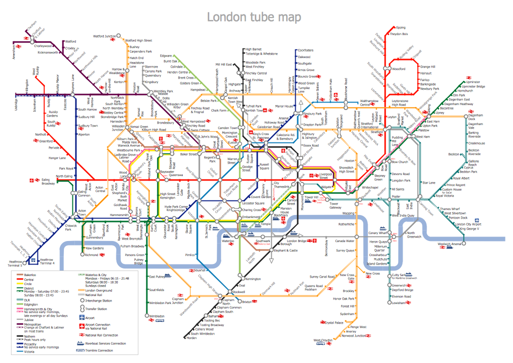
- Geospatial visuals — these can relate to any map or chart that describes a geographical condition. Apart from standard road, transport, and topology maps, these are found in a number of fields; a weather analyst will use precipitation distribution maps and weather patter models, while a political scientist will have need for voter division diagrams and population density maps.
Fig. 5. Mindmap Breakout Project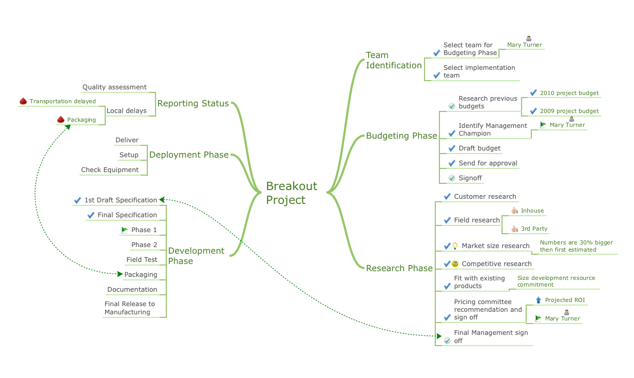
- Infographics — absolutely fundamental to any architect who plans on starting a large-scale construction. For just a single house you could produce garden design plans and property blueprints, wiring and plumbing diagrams, and diagrams showing interior decor and fittings. Business companies can require carefully outlined fire drill plans and building maps.
ConceptDraw's solution

Monday, July 6, 2015
Computer Network Diagrams
When you walk into most modern work offices, there is a good chance you will be greeted by banks of computer screens and terminals, perhaps some sales points screens or server stacks, almost certainly routers and printers. A side effect of this amount of hardware is the amount of cabling necessary to connect these elements into an effective local area network (LAN). With technology and market forces demanding ever quicker business response times, a well-structured computer network is the foundation of positive communication between employees, and with the wider world.
As anyone who has struggled sorting out all the wires behind a television can empathize, it's good to know which cables go where, and what is their function. This is the idea behind a computer network diagram — it can show how a network is connected, how data transfers between those connections, and give an overview of devices and hardware used. To create a practical diagram, the user must adhere to the specified requirements and limitations of the office or building in which the LAN will operate — things such as hardware availability, company budget and customer needs must all be taken into account.
There are two main forms of computer network diagram:
Physical topology diagramThese diagrams show the physical arrangement of a network, the order in which devices are connected, and the cables used to connect them. Which cabling to use is determined by the type of topology employed, and there are three main forms in use currently:
- Star — by far the most common topology, most people at home on their personal computer will be using a very basic form of this. At the center of the network is a hub, generally a router, where each device connects to it only. Data transmissions between devices is managed through this central hub, and sent from it over wired or Wi-Fi connections.
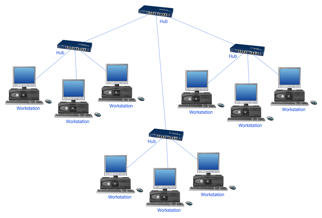
Fig. 1. Star topology
- Ring — as the name suggests, devices using this topology have two connections, joining with neighbouring devices to form a loop. Data passes through the loop, copying itself to any destination address.
- Bus — similar to a ring, but the data travels up and down a linear cable, copying itself where devices act as 'stations' along the route. This method is useful for small networks, or when adding an extra device to one, but should the main cable fail it can bring down the network.
A logical topology adds a further level of detail to a computer network diagram, by showing along which path data is transferred around the network, the network protocols that govern it, and how it is received by the various nodes and devices. They can show elements such as firewalls or software specifications.
While the logical topology can mirror the form of the physical, it is possible for them to be different. For instance, data travelling through a physical 'star' topology will travel ostensibly around a 'ring' within the router, checking whether each device matches the destination address.

Fig. 2. Logical bus with physical star topology
Network architecture
Combining the elements from these topologies creates a layered picture of the network architecture, which can basically be defined as the design of a communications network — a framework for its physical components, and a clearly defined set of principles and procedures. Although these rules can often be quite rigid, a computer network diagram does not just to be a simple arrangement of lines and text — computer network diagram symbols can added and utilized to represent real-world locations, end-user interactions, or specific hardware.
Logical and physical topology diagrams are ideal for depicting LANs, but often business demands a network on a much larger scale. A global network connecting devices in disparate areas is known as a wide area network (WAN), and it will generally use a dedicated form of connection in order to keep up communication, for instance satellite or leased lines. They can be shown on diagrams using the methods outlined above — the diagram will show a 'step back' from a LAN, showing the structure of connections between LANs within the WAN.

Fig. 3. Computer Network Diagram
Drawing tools from ConceptDraw
For many years, the software engineers at ConceptDraw have dedicated themselves to releasing innovative and comprehensive diagramming solutions, adding extra functionality to their award winning software, ConceptDraw PRO. Each one contains libraries of graphic illustrations and symbols, together with user-friendly templates to help the user get started. With the Computer Network Diagrams solution, network architects and heads of IT departments have an all-in-one drawing tool that provides indispensable vector stencils depicting branded hardware, telecommunication devices, and logical symbols that allow freedom of expression in diagram, however complex the network might be.
The support from ConceptDraw doesn't end with the solution libraries. Apart from the quick-start templates provided, the dedicated solution page contains a set of network diagram samples, showcasing the options and styles available. There is also detailed 'How-to' section that goes step-by-step through the process of creating a variety of diagrams, and of course a wealth of video and text material can be found through the ConceptDraw 'Help' section.
Whether rapidly sketching out a personal network, or visualizing complex topology to share with a company team, the Computer Network Diagrams solution for ConceptDraw PRO has all the tools needed to make productive and professional network diagrams.
Wednesday, July 1, 2015
U.S.A. state maps
The United States of America; land of the free, home of the brave, fond of a cliché. A vast nation brought together under the Star-Spangled Banner, but split by state lines, political alliances, and cultural norms. To try and define the country as a whole is a futile task — it's often said the reason many Americans don't travel abroad is because they can experience anything the world has to offer within their borders. Perhaps it's not as hyperbolic as its sounds — sprawling metropolises are buffered by mountain ranges, deserts, forests and beaches; large immigrant communities have been established, including Latino, French, Irish and Caribbean; weather can range between freezing cold, to searing heat, with everything from hurricanes, tornados and dust storms in between. The U.S.A. is divided into 50 states, and the only two that don't border other states give a good example of the cultural and geographical juxtapositions found within the nation — Alaska to the North is a frozen tundra, shutting down in the darkness of winter, whereas the islands of Hawaii are a famed tropical paradise, attracting beach goers and surfers from the world over. They also both contribute to the ethnic diversity of the U.S. with their own indigenous peoples, the Polynesians of Hawaii, and the Eskimo tribes covering Alaska and Canada.
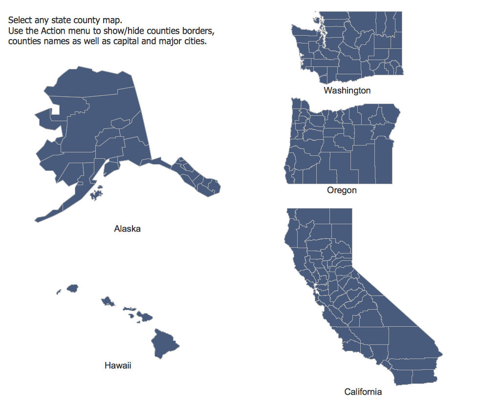
The Pacific states
The 50 states serve as the most recognizable form of geographical division within the U.S., but these can be broken down further into counties and townships. Certain states are officially grouped together into homogenous regions, comprising the North-East, Midwest, South and West. Furthermore, numerous colloquial regions have been identified and become a part of the national lexicon — the deep South, the Bible belt, the mountain states, New England or the Pacific Northwest to name but a few. Governing such an expansive and diverse populace is a challenging prospect. American politics are dominated by the Democratic and Republican parties, and broadly and historically speaking, it can be said the 'Yankee' North favours the Democrats, with the 'Confederate' South supporting the Republicans. Further nuance can be discovered by examining political preferences geographically between states and counties, and combining that data with social factors such as age or race.
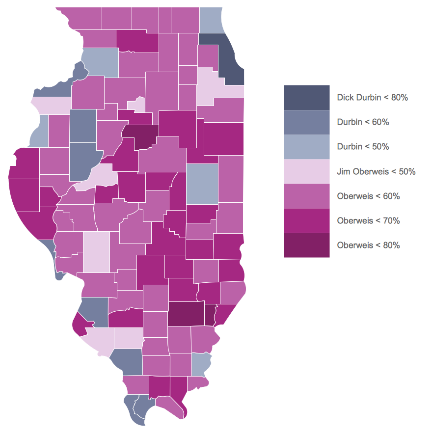
Illinois Senatorial election results 2014
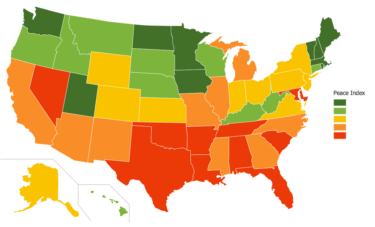
Any country can inspire a wealth of geopolitical statistical data, though America more than most. A common way of assimilating this data is to create maps that convey a particular theme or subject matter in relation to a specific geographical area. Known as thematic maps, they cover themes such as population density, average rainfall, or political allegiance, differentiating the data by using graphical elements and annotation. These are the main three uses for a thematic map:
- To provide specific information about particular locations
- To provide general information about spatial patterns
- To compare pattern between two or more maps
Thematic maps contrast general reference maps, which tend to display information on a variety of subjects — vegetation, topology, roads and highways, for example. A thematic map will always focus on one particular subject matter. When designing these maps, cartographers use five main techniques:
Choropleth mapping — this technique assigns a colour hue or shade to a particular region on a map, that corresponds with a data value. For instance a map of the U.S.A. might colour each state red or blue, to show whether they support the Democrats or Republicans.

Florida population by county
Proportional symbols — these maps use symbols that vary in size depending on the data they are representing. So a U.S. map showing cities might mark them using a skyscraper symbol that grows in size the larger the cities population.
Isarithmic maps — also known as contour mapping, this methodology is used to depict continuous, smooth elements such as elevation levels across a land mass, or a barometric pressure indicator, similar to what you might see on a T.V. weather programme.
Dot distribution maps — in these maps, one dot represents one incident of a certain event or condition. A map focusing on a particular United States region might use a dot to represent each sighting of a grizzly bear in the Pacific Northwest. You will know to avoid travelling to places where the dots are tightly clustered!
Dasymetric maps — similar to a chloropleth map, but doesn't divide the area arbitrarily, instead showing levels of density in reference to the geography of the land. This method can be used to show density of forestry over a large area for example, with a green hue that becomes darker where the concentration of trees are highest.
ConceptDraw have created a new solution, this time offering accurate vector stencil maps of all 50 U.S. states. These can be used as the base for any thematic map of your choosing. The U.S.A. Maps solution for ConceptDraw PRO contains 9 libraries, each covering a certain region of the U.S., and each state map contained within gives the option of adding further detail — an action menu allows you to show or hide county borders, their names, as well as capitals and major cities. Used in combination with ConceptDraw PRO's other features, cartographers are able to annotate their maps, adjust the colour and shading of different areas, and add icons and graphics to enhance a professional looking thematic map.
With major geographical features accounted for, and accurate scaled U.S. state maps, the U.S.A. Maps solution saves time on information sourcing, and makes graphic map design a quick and easy process.


